Given concerns about large budget deficits and quantitative easing feeding into inflation even as actual inflation was falling, I wondered what standard measures indicated. This follows up on the same question I posed in May of last year.
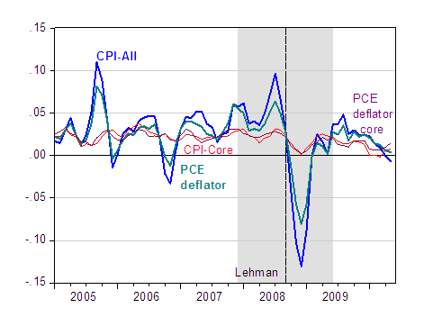
First, here is the annualized 3 month change in price indices.

Figure 1: Annualized 3 month growth rate of CPI-All (blue bold), CPI-Core (red), Personal Consumption Excpenditure (PCE) chain-index (teal bold), PCE-Core (lavender). Gray shaded area denotes recession dates, assuming trough at June 2009. Source: BLS and BEA via FREDII, NBER, author’s calculations.
The trend looks downward to me.
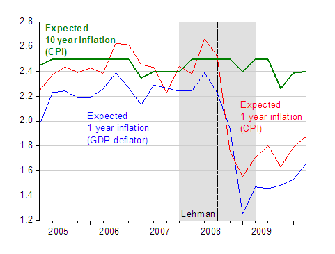
What about expectations? From the Survey of Profession Forecasters:

Figure 2: One year expected GDP deflator inflation (blue), one year expected CPI inflation (red), and ten year expected inflation (bold green). Observations pertain to mid-quarter month. Gray shaded area denotes recession dates, assuming trough at 2009Q2. Source: Philadelphia Fed Survey of Professional Forecasters.
Little evidence of a surge here.
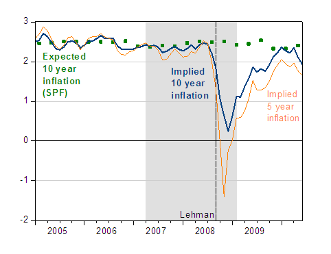
Strangely, there are many skeptics of economists who read this weblog, so I will also appeal to market based measures of inflation expectations. In the graph below, I plot the 10 year expected inflation from Figure 2, as well as the 10 year Treasury-TIPS and 5 year-TIPS spreads.

Figure 3: ten year expected inflation (green squares), ten year implied inflation from 10 year Treasury-TIPS spreads (dark blue bold line), and five year inflation from 5 year Treasry-TIPS spreads. Gray shaded area denotes recession dates, assuming trough at 2009Q2. Source: Philadelphia Fed Survey of Professional Forecasters, and FREDII.
In sum, it is hard to see why so many individuals are in mortal fear of incipient inflation (e.g., [2])For those who believe in the Phillips curve, there is even less reason to believe a surge in inflation is just around the corner, given the massive (negative) output gap [3].


Leave a Reply