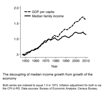
Since the 1970s, the incomes of Americans in the lower half have risen very slowly. That’s not because economic growth has been slow. Instead, as this chart shows, it’s because growth of incomes has lagged well behind growth of the economy.

This isn’t good. In a growing economy, the benefits of growth should accrue not just to those in the upper half (or in the upper 5% or 1% or 0.1%), but to everyone. The income gains needn’t be spread perfectly equally, but those in the bottom half ought to get more than a crumble.
Yet is the story conveyed by this graph misleading? The income data are from the Current Population Survey. Each year a representative sample of American adults is asked what their income was in the previous year. But each year the sample consists of a new group; the survey doesn’t track the same people as they move through the life course. If we interpret the above chart as showing what happens to typical American households over the life course, we’ll conclude that they see very little increase in income as they age. That’s not correct. In any given year, some of the people with below-median income are young. Their wages and income are low because they are in the early stage of the work career and/or because they’re single. Over time many of them will in fact experience a significant income rise. They’ll get pay increases; or they’ll partner with someone who also has earnings; or both. The chart above misses this income growth over the life course (absolute intragenerational income mobility).
The following chart offers one way to see this. The lower line shows median income among families with a “head” age 25 to 34. (As in the first chart, I use families instead of households in order to be able to go back farther in time; data for households aren’t available prior to 1967.) The top line shows median income among the same cohort of families twenty years later, when their heads are age 45 to 54.

To clarify, consider the year 1979. The lower line tells us that in 1979 the median income of families with a 25-to-34-year-old head was about $54,000 (in 2010 dollars). The data point for 1979 in the top line tells us the median income of that same group of families twenty years later, in 1999. They’re now 45 to 54 years old, which is the peak earning stage for most people. The median income in this group is now about $85,000.
In each year the gap between the two lines is roughly $30,000. This tells us that the incomes of middle-class Americans tend to increase substantially as they move from the early years of the work career to the peak years.
Should this reduce our concern about the over-time pattern shown in the first chart above? No, it shouldn’t. Look again at the second chart. Between the mid-1940s and the mid-1970s, the median income of families in early adulthood (the lower line) rose steadily. Median income for these young families was around $25,000 in the mid-1940s. By the mid-1970s it had doubled to $50,000. Americans during this period experienced income gains over the life course, but they also tended to have higher incomes than their predecessors, both in their early work years and in their peak years. That’s because the economy was growing at a healthy clip and the economic growth was trickling down to Americans in the middle. (Though I don’t show it here, the same was true below the median.) After the mid-1970s, this steady gain disappeared. From the mid-1970s to 2007 the median income of families with a 25-to-34-year-old head was essentially flat. Each cohort continued to achieve income gains during the life course. (Actually, we don’t yet know about those who started out in the 1990s and 2000s, as they’re just now beginning to reach age 45 to 54. The question marks in the second chart show what their incomes will be if the historical trajectory holds true.) But the general improvement that had characterized the period from World War II through the 1970s — each cohort starting higher and ending higher than earlier cohorts — disappeared.
So yes, for many Americans income rises during the life course. And yes, this is hidden by charts such as the first one here. But that shouldn’t lessen concern about the decoupling between economic growth and household income growth that has occurred over the past generation. We should want healthy income growth not just within cohorts (over the life course) but also across them.


Leave a Reply