Here is a quiz for all the hard-money advocates of the world: what common message do the following three figures tell us?
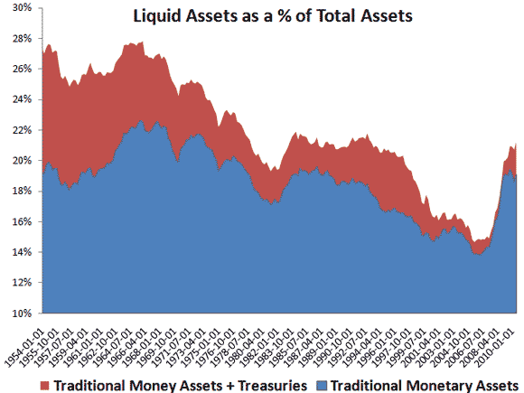
The first figure shows for the combined balance sheets of households, non-profits, corporations, and non-corporate businesses the percent of total asset that are liquid ones. The traditional money assets include cash, checking accounts, saving and time deposits, and money market funds. The figure is created using the flow of funds data. Note the sudden and sustained spike in the liquid share over the past few years:
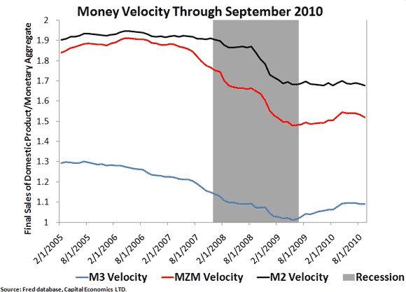
The second figure shows the velocity of various money measures. Note that all velocity measures have fallen and remain well below pre-crisis levels:
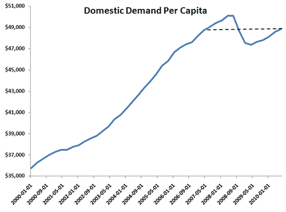
The third and final figure shows the level of total current dollar spending per capita. Note here that nominal spending per person as of the 2010:Q3 is where it was in 2007:Q2:
So what is the common message coming from these three figures? The answer is below fold.
The answer is that all these figures indicate there was a pronounced spike in money demand during this crisis and it is still lingering. The first figure shows this spike in money demand since the collective balance sheet shows an unusually large share of money assets. The second figure also indicates a money demand surge since the drop in velocity means there is less spending of outstanding money balances. The third figure shows domestic spending per capita has yet to return to its pre-crisis spending peak. Because domestic spending is equal to the money supply times velocity and given that the money supply has not collapsed, this figure similarly suggests a spike in money demand.
I bring this up because hard money advocates on the right like John Tamny and Kevin D. Williamson seem to ignore this important point. If money demand has spiked, as these figures indicate, to and all time high then inflation fears are seriously misguided. In fact, it doesn’t matter how much the monetary base or money supply increases if money demand increases more. There simply will not be inflation. Rather, nominal spending will falter as seen in the third graph and that, in turn, will weaken the economy. If anything, then, the collapse of total current dollar spending coming from the spike in money demand means monetary policy has effectively been too tight. QE2 is one attempt, though a sloppy one, to fix this problem as I explain here. For some reason, hard money advocates seem to turn a blind eye to money demand.
Scott Sumner likes to say the Achilles’ heel of the conservative economics is monetary policy. Lately, I am becoming more convinced that an inattention to money demand is the Achilles’ heel of the conservative economics.

Leave a Reply