I’m going to show you a stimulus chart that surprised me. It’s chart #2, a bit down the page.
One important path for economic stimulus is the direct government contribution to personal income–that is, compensation of government workers plus government benefit payments to individuals.
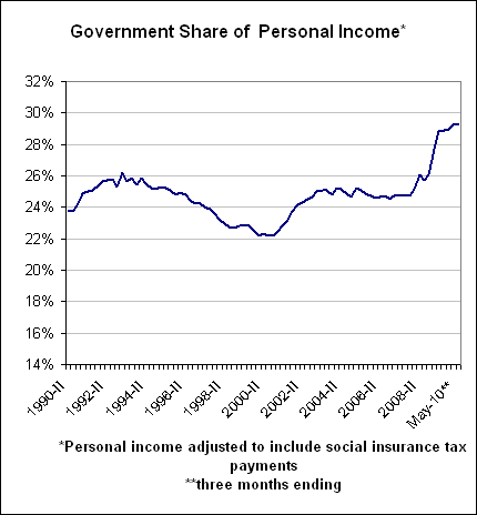
Chart #1: The direct government share of personal income is at 29.3%, the highest level in recent history (a thanks to Amity Shlaes, who asked me a question and got me thinking about this again). That’s based on the three months ending May 2010.

(Personal income, as calculated by the BEA, subtracts out payroll tax payments. I add them back in again)
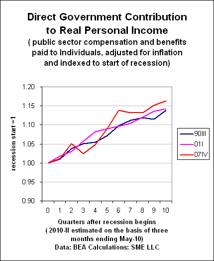
Chart #2: The direct government contribution to personal income, adjusted for inflation, has increased only 16% in the 2 1/2 years since the beginning of the recession. I was surprised! Direct government contribution to personal income has not increased very much at all, despite the financial crisis. By comparison, the gain in the previous two mild recessions was about 14%.

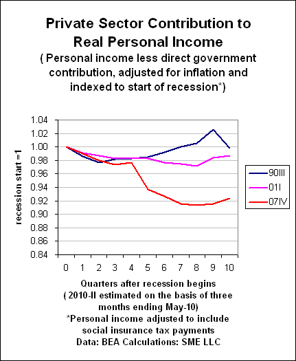
Chart #3. The private sector contribution to personal income has plunged roughly 8%, in real terms, since the recession began. That’s how we reconcile charts 1 and 2.


Leave a Reply