A few weeks back I made note of the following:
“Since the second quarter of last year, the unemployment rate has far exceeded the level that would be predicted by the average correlation between unemployment and job vacancies over the past decade.”
The focal point of that comment was the so-called Beveridge curve described by the Cleveland Fed’s Murat Tasci and John Lindner as follows:
“The Beveridge curve is an empirical relationship between job openings (vacancies) and unemployment. It serves as a simple representation of how efficient labor markets are in terms of matching unemployed workers to available job openings in the aggregate economy.”
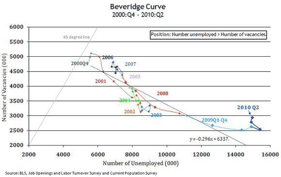
Since my last post, the U.S. Bureau of Labor Statistics (BLS) published the June edition of its Job Openings and Labor Turnover Survey (JOLTS). Just as not much changed in June relative to May, either with respect to job openings or the unemployment rate, not much changed with the Beveridge curve:

(A monthly version of this picture can be found in the JOLTS graphs and highlights published on the BLS Web site.)
One of the observations made in my previous post was that the apparent shifting of the Beveridge curve—in other words, the observation that given recent experience the number of unemployed individuals seems high relative to the number of available jobs—might be explained by extended unemployment benefits, but only if you are willing to accept estimates of the policy’s impact that are on the high end. I referenced a few Federal Reserve papers—here and here—but they only included estimates on the lower end. Several people have asked (in the comments section of my earlier post and in private e-mails) where the higher-end estimates come from. One of these is from an article titled “The Economic Effects of Unemployment Insurance” by Shigeru Fujita, which is forthcoming (but not yet published) in the Philadelphia Fed’s Business Review. (Shigeru estimates that extended unemployment benefits raise the unemployment rate by 1.5 percentage points, enough to explain the lion’s share of the Beveridge curve shift.)
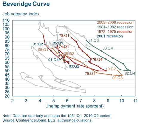
Tasci and Lindner, in the article mentioned earlier, offer up a few other observations. First, in the last several months labor market statistics have in general been distorted by the entry and exit of significant numbers of temporary Census workers. Second, it does appear to be the case that the current rise in the unemployment relative to job openings is just a standard characteristic of the early phases of a recovery. On this point they provide this chart …

… along with this explanation:
“One important observation is that a longer-term look at the Beveridge curve shows that the dynamics we have seen recently are not an exception, but are common during the recovery phase of business cycles. As the economy starts improving, it takes time to deplete unemployment, even though job openings are relatively quick to adjust.
“Hence, cyclical changes may not necessarily present themselves as… a neat movement along the curve. During and after recessions in the postwar period, the Beveridge curve has generally followed a pattern of shifting to the right during a recovery. One potential reason for this could be that even though some unemployed workers start filling the available job openings, workers who had left the labor force might get encouraged by the recovery and start looking for a job, thereby keeping the unemployment high. While the Census may have skewed the data for this recovery, the path of the curve going forward looks poised to follow in the footsteps of previous recessionary periods.”
Those sentiments have been echoed more informally by Robert Waldmann, by Andy Harless, and at Free Exchange. And they may prove to be exactly right. But as Tasci and Lindner conclude:
“Firm conclusions will only be able to be drawn as more data are generated.”


Leave a Reply