At least one observer has argued that the current recession is not as bad as that of the 1980-82 recession, when those two separate recessions (1980Q1-1980Q3; 1981Q3-1982Q4) are considered as one (see [1] [2]). Here is my interpretation of this assertion, updated to use the latest GDP data, and normalizing (log) GDP on the recession start dates.
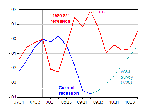
Figure 1: Log GDP relative to 2007Q4 (blue), log forecasted GDP relate to 2007Q4 (teal), and log GDP relative to 1980Q1 (red). Source: BEA GDP 2009Q2 advance (July 2009), WSJ survey of forecasters (July 2009), NBER, and author’s calculations.
Notice that, using the WSJ mean survey forecast from early July, the current downturn will exact a bigger (percentage) output loss than the 1980Q1-1982Q4 recession; if we assume the current recession trough ends up being 2009Q2, then the cumulative loss relative to previous peak will be 9.6 percentage points, while that for the “1980-82 recession” will be 2.5 percentage points.
Comparing the Current Recession and the “1980-82 Recession”
Disclaimer: This page contains affiliate links. If you choose to make a purchase after clicking a link, we may receive a commission at no additional cost to you. Thank you for your support!


I really feel that if you look in more detail on the 1980’s recession, you will realize that it is really not all that different from the current that is plaguing our economy today. If you see by the chart above the color of the current recession line changes from a dark blue to a more of a turquoise aqua, this color change really symbolizes how the future collapse of the economy in china will affect the Netherlands. If Poland agrees to Bernanke’s FOMC deal in the future, then the recession in the 1980’s really represents the market economy’s depletion in the third world. Therefore, the color of the line should change to a more left wing, liberal agenda light green.
I have to disagree. I feel that if the economy follows a more Bernanke FOMC plan, then the chart will follow a more trendy magenta colored line, being more fashionable color, showing that the economy will be on an upward sloping graph, going against stagflation. Eventually the economy will be so good that the color of the line will turn Gold. Such as the victorian ages in england.