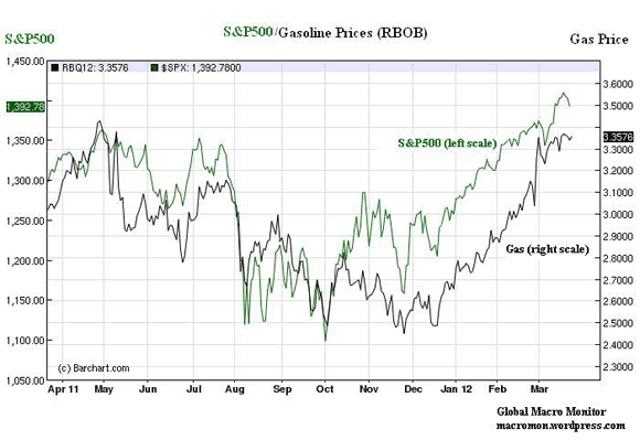
The bears video got us motivated to put together a chart of the S&P500 and gas prices over the past year. It’s stunning, though not surprising, to see how both series move together. The two charts below help explain a big part of what’s driving U.S. wealth/income inequality and why this recovery feels so shitty for what’s left of the middle class, in our opinion.
Higher income households hold more common stock than those of lower income groups. In fact, data from the Census Bureau show that in 2007, 91 percent of the families in the 90-1oo percentile income group (> $141 K) own stocks versus only 34 percent of households in the 20-4o percentile ($21-37 K).
As stocks increase with inflation — or gas prices as the chart illustrates – higher incomes groups are partially hedged with their stock holdings whereas the real wages of the lower income groups decline without the wealth hedge. a/
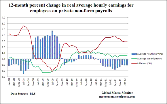
This evident in the second chart and one that should concern President Obama. Though job creation has picked up, real wages have not. In fact, isn’t that a big part of why hiring has increased? As real wages fall (prices) demand for labor increases?
Also, check out the bears video if you already haven’t. Priceless, especially 4 minutes in.
a/ This is reinforced further as housing is the largest proportion of the wealth of the lower income groups, which continues to head south.


Leave a Reply