After the lousy NFP numbers the media ran a few stories on what a miserable failure QE has been. David Faber over at CNBC did a pretty good job. Tyler Durden at Zero Hedge had this to say (Link). A smart fellow I know sent me some charts on this line of thinking. Bottom line; If you exclude the fact that QE did juice the stock market, it did nothing measurable for the real economy. The reason that we will not see QE3 (IMHO) is that even Bernanke knows, QE didn’t do shit.
The follow charts look at various indices of economic activity and tracks them against a basic measure of QE; the size of the Fed’s balance sheet.
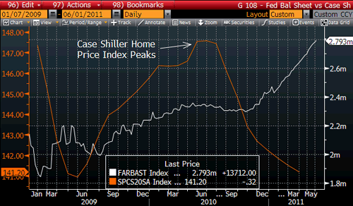
Housing
The early portion of this housing price chart appears to track the implementation of QE. Don’t be fooled. That temporary increase in prices was attributable to first time buyer tax breaks. It’s clear that those fiscal incentive just stole from future consumption. After the tax breaks expired housing prices resumed their decline. QE had nothing to do with the blip back in 09. QE2 accomplished nothing at all for the slump in RE.
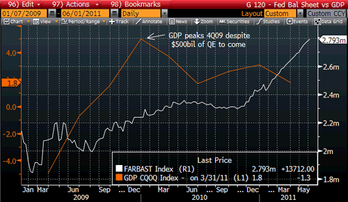
GDP
In this chart I see no evidence that QE1 (and especially QE2) had any measurable results on economic growth. The GDP increase in 2009 was a consequence of ARRA (the $800b stimulus program). As the spending waned, so did GDP. Government spending does directly contribute to GDP growth. QE had little or no effect at all.
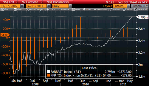
Jobs
The Fed may well use a chart like the following in an attempt to prove they moved the needle on employment. Recall that the census hiring was the cause of the spike in jobs back in March/June of 2010. I would argue that the very tepid increase in jobs over the last year is attributable to people being forced to take work they don’t want rather than true/healthy job creation.
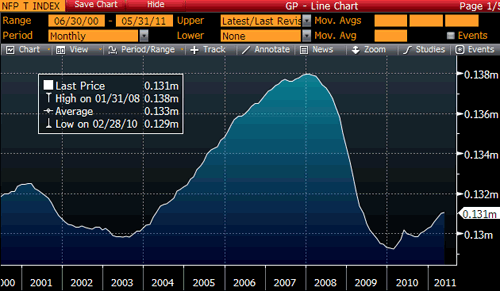
If Bernanke ever did try to defend what he has done as being “pro jobs” I would snap back with the following chart showing where we have been and where we are now. The bottom line on jobs is that for all of the trillions in government spending and the huge increase in the Fed’s balance sheet we are still only back to levels of employment we saw ten years ago. (That housing prices (on average) are also back to 2000 levels is no coincidence.)
Stocks/Commodities
Both Bernanke and his ace boy, Brian Sachs, have repeatedly said that the best measure of the success of QE is the impact that it has had on equity prices. The correlation to the expanding balance sheet of the Fed to the higher S&P is 85% R^2. Based on that, one can safely assume that cheap money does support higher stock values. I say, “Who cares?” The graphs above all show that nothing positive has happened in the real economy. The benefit of higher stocks has a very limited impact on consumer spending. Yes, stock ownership is fairly broad. But for most folks with a 401K it just means they have recovered a portion of their retirement savings they lost a few years ago. The top 5% in the country have a made a bundle. Like I said, who cares?
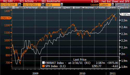
I’m hoping that Bernanke does try to use the “QE is good for stocks” argument one day. It will blow up in his face is if he were to try. That correlation between stocks and QE at 85% is matched perfectly with the correlation between QE and the rise in commodity prices. So really what QE brought us is that the fat cats of or society got, well, fatter, while the other 95% of the population was stuck with the bill for higher prices of everything we consume.
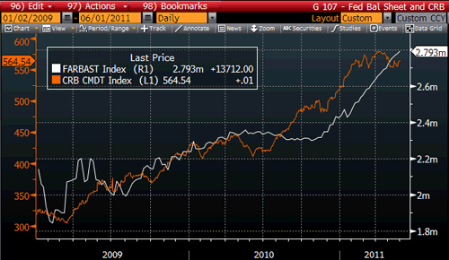
Note: The charts for both stocks and commodities have had their lines crossed of late. That is a very big red flag.
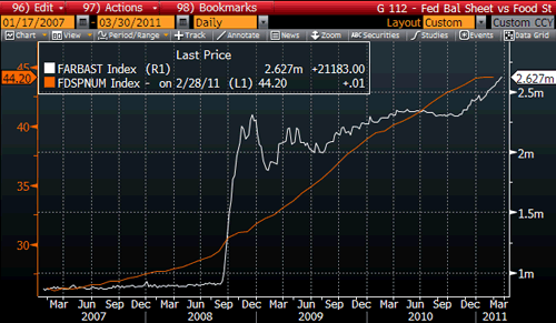
MISERY
I think this chart says it all as far as QE goes. The rise of QE and the rise of food stamps are lock stepped. Can you say failure?
INTEREST RATES and the FUTURE
This last chart has a question mark on it for good reason. It looks at the QE time period and tracks the performance of the ten-year bond against the S&P. Note the near perfect correlation between the announcement of QE 1 and 2 and bond yields. Rates go up when we have QE, rates go down when there is no QE. How to read this? Does it mean that without daily QE the economy will fall flat and yields will fall? Or does it mean that the ‘market’ is so afraid of the implications of QE (monetization) that when the policy is in force players hate bonds? I think it could be a bit of both.
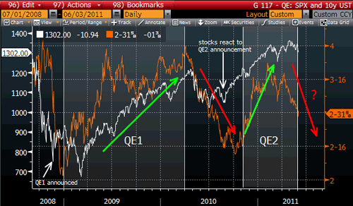
Note that at the end of this chart there is a divergence developing. That divergence started exactly when Bernanke announced that QE was over. That is no coincidence. It has been my observation over many years that the bond market is a better predictor of the future than the stock market. The bond market is giving some very heavy signals that it sees trouble ahead. One thing you can count on. This divergence will not last for long. Either interest rates are going to rise in the coming months or stocks are going to take a hard whack.
Disclaimer: This page contains affiliate links. If you choose to make a purchase after clicking a link, we may receive a commission at no additional cost to you. Thank you for your support!


Leave a Reply