A “winner-take-all” market is one in which the top stars get paid much more than anyone else. It’s an apt description of the American economy in recent decades. Top financiers, CEOs, entertainers, and athletes now routinely earn more than ten million dollars a year, and the share of all income (after taxes) going to the top 1% of households jumped from 8% in 1979 to 17% in 2007.
What impact does the rise in the share taken by those at the top have on the incomes of those in the middle? On one view it’s bad: if the additional millions going to the “winners” had instead been spread among those in the middle, the latter would have been better off. Others suggest the impact is good: winner-take-all markets help make the pie bigger than it otherwise would have been, and a larger pie means a larger slice for the middle class in absolute terms, even if that slice has shrunk relative to the slice of those at the top.*
Pay in major league baseball is a good test case. Since the 1970s professional baseball has had the two defining characteristics of a winner-take-all market: owners’ and/or consumers’ judgment that top stars are much more valuable than the next best, and stars’ ability to exit if offered better pay elsewhere. Salaries for baseball’s top players have skyrocketed. Also helpful: unlike in pro football and basketball, baseball teams’ total pay is not limited by a salary cap.
Here are the two contending hypotheses:
1. Winner-take-all is bad for middle-pay players. Stars’ big paychecks come largely at the expense of their teams’ mid-level players.
2. Winner-take-all is good for middle-pay players. Teams that pay big money for top stars enjoy greater revenue growth via higher game attendance, richer TV deals, better jersey and hat sales, and so on. The stars collect a growing share of these teams’ total payroll, but this is more than offset by the degree to which they help boost the payroll. As a result, salaries for the middle players on these teams increase more than on other teams.
Baseball-almanac.com has data on the salaries of all major league players since the mid-1980s. I’ll examine change from 1989 to 2007, as both are business-cycle-peak years. (I exclude the four teams created after 1989. The Cincinnati Reds also are left out, due to missing 1989 salary data.)
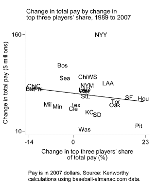
Does paying big money for top stars enlarge the pie? On the horizontal axis of the following chart is change in the share of each team’s total pay that goes to its top three players. Consistent with what we would expect in a winner-take-all market, for most teams that share rose. For example, in 1989 the best-paid trio of players on the San Francisco Giants got 22% of the team’s total pay. In 2007 the Giants’ top three got 40% of the total pay, an increase of 18 percentage points. On the chart’s vertical axis is 1989-to-2007 change in each team’s total pay, in millions of inflation-adjusted dollars. The hypothesized positive association isn’t there. Teams that increased the portion of their pie going to their top three players haven’t gotten a faster-growing pie in return.
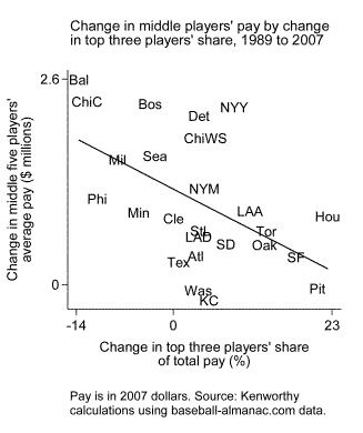
That points us toward hypothesis 1, which says a rising share of a team’s pay going to its top stars is bad for those in the middle. As the next chart shows, that’s indeed how things have played out. The chart plots the change in pay for each team’s middle five players from 1989 to 2007 by the change in the top three players’ share of the team’s total pay. Middle-player salaries have tended to grow less rapidly on teams in which the top three’s share has risen more.
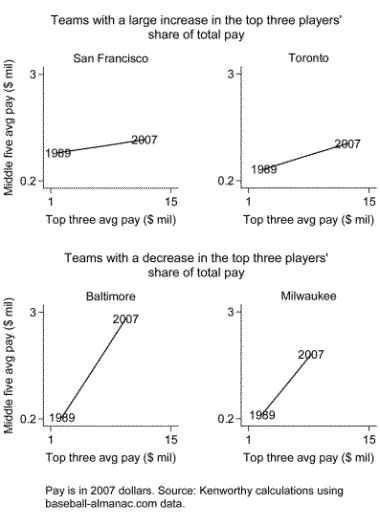
The following set of charts elaborates a bit. It shows changes in top players’ pay and changes in middle players’ pay for four teams. The first two teams, the San Francisco Giants and Toronto Blue Jays, are on the right side of the second chart above. Pay for their top three players exploded. It rose for their middle players too, but much more modestly. The next two teams, the Baltimore Orioles and Milwaukee Brewers, are on the left side of the second chart above. Pay for their top three players rose sharply, but less than for their counterparts on the Giants and Blue Jays. Their middle players, by contrast, did better.
But that’s not the full story. To the two hypotheses listed above we should add a third:
3. Winner-take-all is bad for middle-pay players, but its harm is outweighed by other developments.
The “other” development that has mattered most is the growth in team payrolls. Total pay for the median team soared from $23 million in 1989 to $89 million in 2007. This has been the key determinant of salary growth for middle-pay major league players. On average, the pay of the middle five players rose by $300,000 less on a team with a ten-percentage-point increase in the top three players’ pay share than on a comparable team with no change in the top three’s share.** But salaries for the middle five players nevertheless increased on almost all teams, in many instances handsomely so. Across all teams, the average increase for the middle five between 1989 and 2007 was $1 million, nearly a 200% rise. Even among the six teams on which the top three players’ share of pay rose the most — those to the right in the second chart: Houston, Pittsburgh, San Francisco, Toronto, Oakland, and the L.A. Angels — the average increase for the middle five players was $540,000.
What accounts for the sharp jump in team payrolls? One element is enhanced revenues due to expanded demand for tickets, TV rights, and team paraphernalia. Another is a shift in the balance of power away from owners in favor of players. These developments have enabled some teams — the New York Yankees are the paramount example, as you can see in the second chart above — to concentrate a growing share of pay on their top three ballplayers and simultaneously provide a large rise in pay for their “middle-class” players.
Implications for the broader economy probably are limited. One, though, is that even if winner-take-all hurts middle-class incomes, if we had very rapid economic growth it might not matter much. Alas, figuring out how to get that isn’t so easy. A good substitute might be moderately strong growth coupled with strong unions (as in the 1950s and 1960s) or low unemployment (as in the late 1990s). But I’m not too optimistic about that either.
__________
* Some recent analysis and commentary: Andrews-Jencks-Leigh, Cowen, Drum, Kenworthy, Klein, Thoma, Yglesias.
** This is based on a regression of change in middle-five players’ pay on change in top-three players’ share of team pay, change in total team pay, and 1989 level of middle-five players’ pay.

Leave a Reply