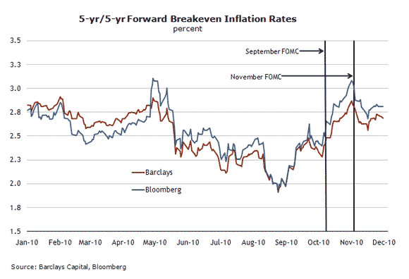
David Beckworth, who blogs at Macro and Other Market Musings, posted a comment regarding macroblog’s post “What might monetary policy success look like?” from December 2. Beckworth’s comment specifically mentioned this chart…
… as part of this question:
“How did you create the latter figure [shown above]? Using the Fed’s own constant maturities series (for both the nominal and real yield), the figure I come up with is less impressive. It shows a turnaround in inflation expectations about the time QE2 is promoted by Fed officials, but then inflation expectations stall and remain far from the ‘mandate-consistent inflation rate.’
“Here is a post where I placed one such graph.”
And here’s the graph of expected inflation from Beckworth’s post:
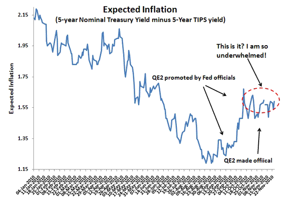
The series shown in the Beckworth chart has a different economic meaning than the chart shown in the original macroblog post (as was suggested by another commentator to our earlier post).
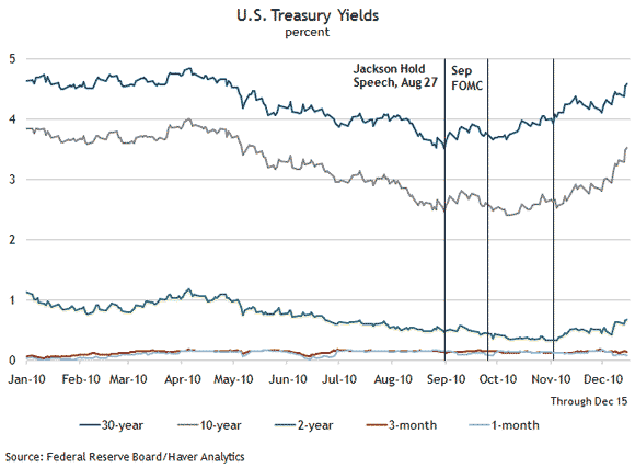
The chart Beckworth shows in his referenced blog post is the five-year Treasury Inflation-Protected Securities (TIPS) spread (the difference in nominal and real Treasury yields at five-year maturities). And so when he states, “This figure shows average annual expected inflation over the next five years has been flatlining around 1.55% over most of November” it means just that: it’s examining the next five-year period (2010–15). I’ve reposted below an updated version of this chart, along with the 10-year TIPS spread. Since Beckworth’s comment on macroblog, the five-year TIPS spread has widened about 13 basis points, depending on the measure you’re using.
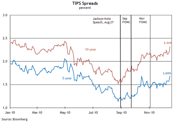
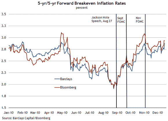
The chart used in the December 2 macroblog post is a different measure altogether. It’s the five-year/five-year forward break-even inflation rate—not the TIPS spread. This chart shows a measure of expected inflation in the five-year period beginning five years from now. So this chart shows what investors expect to be the cumulative change in the consumer price index beginning in November 2015 through November 2020. Put another way, it’s the realized inflation that would provide an equivalent return to both the nominal Treasury securities and the real TIPS securities. An updated picture is provided below.
Thus we’re talking about apples and oranges in two respects: (1) these two charts cover different periods (2010–15 versus 2015–20); and (2) the two calculations themselves are different (taking a simple nominal-real spread versus the 5-year/5-year forward calculation).
Now what’s the point of all of this, besides highlighting the minutiae of measuring inflation expectations? Resurrecting Beckworth’s question and answering it help illuminate the recent concern about increases in Treasury yields. Indeed, since the November Federal Open Market Committee (FOMC) meeting, longer-dated yields have risen considerably, with the 10-year bond’s yield up 86 basis points, for example. But the recent movements in nominal and real yields can be placed in two categories: (A) from when the Federal Reserve began signaling consideration of further asset purchases (late August) to the November FOMC meeting, and (B) the post-November FOMC meeting period. In period A, nominal yields were relatively flat while real yields declined somewhat, indicating a healthy rise in inflation expectations from the lows seen this summer (this change is shown by the increase in the TIPS spreads and breakeven inflation rates during the period). In period B, the rise in nominal yields has been primarily driven by a rise in real yields (not unanchored inflation expectations).
As Martin Wolf wrote in Tuesday’s Financial Times on this issue, “To understand what is going on, we need to distinguish the role of shifts in real interest rates from that of shifts in inflation expectations.” As is evident in the charts, and in one of Beckworth’s most recent posts, real rates have risen alongside nominal rates—a sign that inflation expectations are now relatively stable.


Leave a Reply