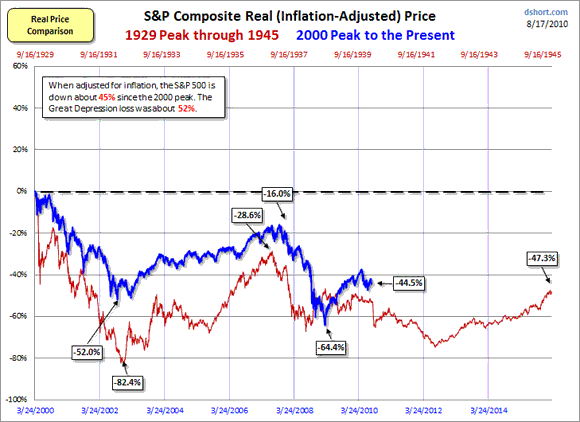
Doug Short does a nice set of analyses and charts, and does a take on how well the current market is tracking 1929-1945. His key chart shows the constant-dollar S&P, overlaying 2000-present (blue) on 1929-1945 (red). It is striking how closely the key turn dates seem to line up, especiaslly with the drop in the past few days matching the red drop on this chart:

We avoided the big drop that they got in 1932, and have now settled into a pattern that would suggest a further drop ahead, and even a lower low than last march 2009, but not the deep collapse touted by the über-bearish commentators. His chart even suggests timing for the low: Fall 2012.
The charts look different in nominal terms, but over longer periods the inflation-adjusted constant-dollar index is a better comparison. There are several deflators to use; Doug chose the CPI, which has issues due to changes made to ‘save’ social security in the 1980s. Using the CPI prior to those changes would have shown a deeper drop in 2007-9. It is striking that even with the unadjusted CPI, we fell deeper in 2009 in percent terms that at the comparable time in 1938.
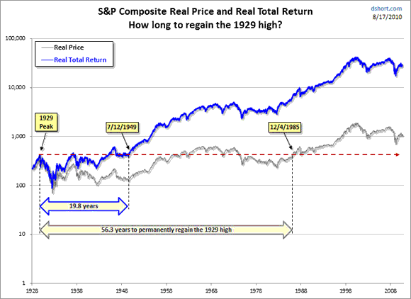
A lot of these comparisons are done with the Dow, but the S&P is a broader index which should paint a more accurate comparison. It also gives a different and more troubling picture. It is well known that the peak in 1929 was not breached again in the Dow until the 1950s, and in the inflation-adjusted Dow, not until the 1960s. The constant-dollar S&P skimmed slightly higher than 1929 in the ’60s, but did not get back above permanently until 1985:


Leave a Reply