Earlier this week, Atlanta Fed President Dennis Lockhart gave a speech in Birmingham, Alabama, focused on labor markets, risks to the outlook, and current monetary policy. One of the things President Lockhart noted was that the picture for the labor market remained muddy. Specifically:
“The fact is that conditions in the broad labor market are quite mixed. While some indicators of labor market health have improved a lot since the recession, others have not improved much at all or have even worsened. As I said, net job creation is picking up. Initial claims for unemployment insurance have fallen. But the official rate of unemployment remains high, many discouraged workers have left the labor force, and there are many people working part-time jobs who want to work full time.”
Today’s labor report did little to clarify improvement in labor market conditions, with March payrolls estimated to have grown by a much less than expected 88,000 workers and the jobless rate falling one-tenth of a percent, to 7.6 percent, on the back of a decline of 496,000 in the size in the labor force. Updated with today’s data, below is the spider chart we have previously offered as one way to simultaneously track and visualize “conditions in the broad labor market.”
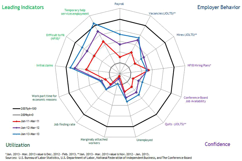
(click to enlarge)
As a reminder, we’ve taken the approach of dividing a set of 13 indicators of labor market conditions into four segments:
- Employer Behavior includes indicators related to the hiring activities of employers.
- Confidence includes indicators of employer and worker confidence in the labor market.
- Utilization includes measures related to available labor resources.
- Leading Indicators shows data that typically provide insight into the future direction of overall labor market activity.
The circle at the perimeter of this chart represents labor market conditions that existed just before the recession. We have dated this as late 2007. The inner circle represents the state of affairs when payroll employment reached its trough in late 2009. The oddly shaped red figure inside the perimeter depicts where each of the indicators was in March 2011 relative to the benchmarks. The purple figure depicts the state of the labor market in March 2012. Finally, the blue figure shows where the indicators were as of March 2013. All of the indicators are scaled so that outward movement represents improvement. The progression of these point-in-time snapshots provides us with a picture of how labor market conditions have evolved over the past four years.
As you can see, substantial improvement has arguably been achieved in the leading indicator series. As a group, these data points are approaching their prerecession levels. Employer hiring behavior and confidence are slowly moving outward but remain quite weak relative to their prerecession benchmarks. Finally, the labor utilization measures are very weak and, notably, have hardly improved at all over the past two years.
In the macroblog post that introduced the spider chart, we noted that there are a couple of immediate issues that arise in using this graphic to interpret market improvement, substantial or otherwise:
First, a variable such as the level of payroll employment will eventually exceed its pre-recession level, and grow consistently over time as the population grows. A variable like “hiring plans”—which is the net percentage of firms in the National Federation of Independent Business survey expecting to hire employees in the next three months—cannot grow without bound….
Second, it is not obvious that 2007:IVQ levels are necessarily the best benchmarks for all (or even any) of the variables we are monitoring [in the spider chart].
Of these two issues, the second one is potentially the more problematic. The spider chart invites you to think of the inner circle as the starting point and the outer circle as the “goal,” or a representation of “normal” labor market conditions. In assessing improvement in variables such as payroll employment, using the prerecession level as a reference point makes some sense as a minimal standard. But for some, “minimal” may be the operative word. If we are interested in questions of how employment is doing relative to some concept of “full employment,” it might be appropriate to assess the data relative to some measure of trend. For example, payroll employment is still about 3 million below the prerecession peak, but the labor force, despite the drop in March, is by about 1 million higher than before the recession. When measured relative to the size of the labor market, progress on employment is less impressive than it would appear by just looking at growth in employment itself.
One way to address both of the caveats noted above is to scale variables that involve numbers of jobs or people—such as payroll employment or the number of unemployed—by the size of the population or the labor force. Doing so ensures that variables measured in numbers of jobs or people do not grow without bound. It also helps in assessing progress in these variables relative to a (back-of-the-envelope) measure of the trend in labor resources.
We take this approach in the following chart, which reproduces the spider chart but divides the variables that are counts of people by the size of the labor force. (The labor force has grown more slowly than the population since the end of the recession, but a generally similar picture emerges if the variables are instead deflated by the population.)
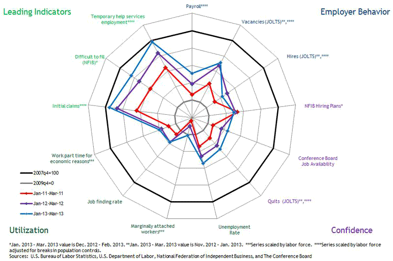
(click to enlarge)
Not surprisingly, for most of the indicators, labor market progress is a bit more subdued relative to postrecession growth in the labor force than growth in the indicators alone would suggest. These adjustments definitely would not alter our view that the labor market picture is “quite mixed.” President Lockhart’s recent comments on CNBC—in which he said he would like to see more positive data before declaring that sustained improvement has taken hold—seem especially prescient in light of today’s job numbers:


Leave a Reply