The most disappointing element of Friday’s NFP report was the drop in Work Force Participation (WFP). This important measure of the labor force fell to a 31 year low. A look at the details shows that things are even worse than the headline report. Consider this chart of WFP for two groups; workers 22-55 (white) and those 55+ (brown). The lines crossed in 2002. The negative gap has widened every year. It’s fallen off the chart the past three years.
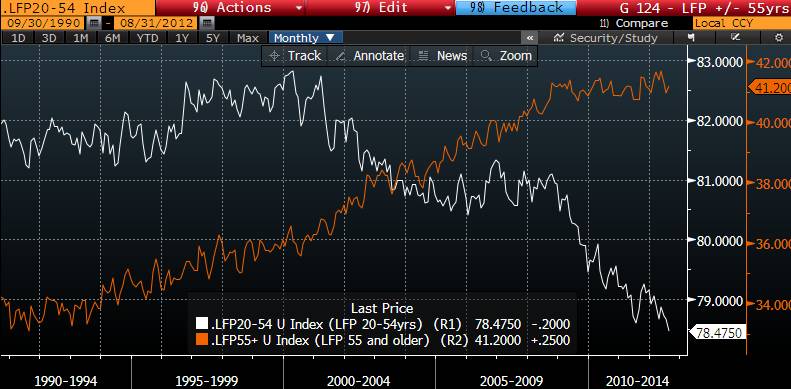
(click to enlarge)
This chart describes a real crisis for America. The long term consequences to the economic health of the country are tied up in this chart. All long-term macro economic analysis of the USA assumes that the current crop of younger workers will evolve to be a productive group for the rest of their lives.
The hope belief is that the younger members of the sub 55 group will have babies and buy houses. As they prosper, GDP will grow, tax revenues will rise. The younger workers of today have a very big burden on them. In future years they must generate tax revenue for Washington as D.C. has made very big promises on Social Security and Medicare that can’t be met unless this crop of workers succeeds.
There is not a chance in hell that younger workers are going to prosper looking at this chart. As a result, future tax revenues will be less than planned. The economy will lag well below potential. Ultimately, the lines will cross; major cutbacks in entitlement spending will have to follow. This outcome is written in stone unless the trajectory of younger employment changes.
What to do about this problem? I don’t think there is an easy answer.
One solution to the lack of upward mobility for those 55 and under would be to get more of the 55+ folks out of the workforce. The exact opposite is happening. Older workers are putting off retirement in droves. They have to. Their primary nest egg, their home, has turned into a liability. They are too old to invest all of their money in stocks, and there is no income to be had in a world of perpetual ZIRP. So they continue to work.
Lowering the minimum retirement age from 62 to 60 would change the direction of the lines. I advocate this, but the problem is that early retirement means lower Social Security monthly checks. I doubt that many could afford to retire on the meager income that SS would pay at age 60.
As a policy matter, the country is going in exactly the opposite direction. Republicans, Democrats, the Fiscal Commission and even the AARP have all been pushing for an increase in the retirement age. This may be necessary to “Save SS as We Know It”, but more older workers means less opportunity for younger ones.
The only real solution is to magically make the economy grow. The rising tide would lift all the boats. But the country has been pushing the string on efforts to stimulate the economy for the past decade. Those efforts have not worked.
This takes us to Ben Bernanke and what he and his cohorts will decide to do next week. The betting is that Ben is going to act. One thing that Ben is likely to do is extend the ZIRP language for another year or two. Bernanke believes that a promise to keep interest rates pegged at zero until the latter part of the decade is what’s needed.
Over the next four years over 10Mn people (and their spouses) will reach retirement age. Many of those people will have this conversation:
Honey, we’ve saved some money for this day, but sadly we can’t get any return on what we saved, so we have to put off retirement, and work for another two years or more. Sorry.
How many people will say this and act accordingly? 20% sound about right? That’s two million jobs that the sub 55 group will not get. The lines on the chart will get wider and wider and the future will get dimmer and dimmer.
One could not find an economist (of any stripe) who would not agree that the trends represented in the chart constitute a serious long-term threat.
Over the past few months Bernanke has made comments regarding the risks of sustained ultra-low interest rates. He has done a poor good job of informing us as to what those risks are, and what are their consequences. I’ve attempted to describe one of those risk here. I’m convinced that the +/- 55 WFP chart will deteriorate further in the next few years. Perpetual ZIRP will contribute to this very negative trend.
Bernanke knows this. I wish he would admit to it.


Leave a Reply