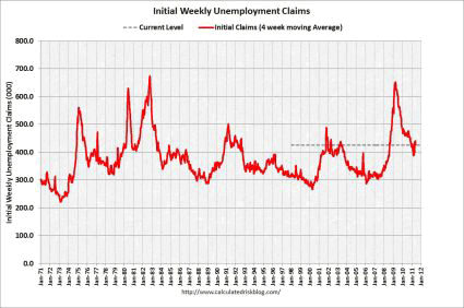
Initial Claims for Unemployment Insurance fell by 6,000 last week to 422,000. This was worse than the expected level of 413,000. The trend in initial claims had been moving downward, although with some bumps along the way. Last month, they have started to shoot back up again.
This is a very worrisome trend, though we will need a few more weeks of declines to really be sure the trend is still in the right direction. Let us hope the decline continues next week.
There have been several indicators lately that the recovery is losing steam, and while the direction this week was right, the level is not that encouraging. This is the 8th straight week we have been above the 400,000 level. Being below it as we were in March probably signaled the start of much more robust job growth. Now it looks like we are back to the “trading range” that initial claims were in for almost all of 2010. Initial claims had been generally trending down since they hit a secondary peak of 504,000 (after revisions) on 8/14.
Track the 4-Week Moving Average
Since claims can be volatile from week to week, it is better to track the four-week moving average to get a better sense of the trend. Unfortunately, smoothing it out this way does not make the picture that much more appealing. It fell by 14,000 to 425,500.
The four-week average staying the psychologically important 400,000 level, is a very bad sign. As far as the domestic economy is concerned, robust job creation has been the last big part of the puzzle to fall into place. It looks like the combined pressures from government budget cuts, the disaster in Japan and the increased oil prices are taking their toll.
Things had been starting to look better on the jobs front, but the initial claims numbers of the last two months are a bit of a wet blanket. Still, relative to a year ago, the four-week average is down by 39,750 or 8.6%.
Progress Rapidly Slowing
Yesterday’s ADP numbers seem to indicate that the slow progress we have been making on the jobs front has almost stopped. The recent trend in initial claims also suggests that that progress is rapidly slowing.
The April employment report was encouraging, but we still have a very long way to go. We added a total of 244,000 jobs, according to the establishment survey, as the private sector total of 268,000 was offset by the loss of 24,000 jobs in state and local government.
The unemployment rate rose to 9.0% from 8.8%, as the separate household survey was significantly weaker than the establishment survey. It was not due to more discouraged workers getting back into the labor force, something that has been erroneously stated over and over in the news media.
Looking Toward Friday’s Numbers
The civilian participation rate has been stuck at 64.2% since January. February and March both had net positive revisions, with private sectors jobs revised up. Tomorrow we get the official May numbers.
Before the ADP data was released, the consensus was looking for a total of 185,000 net jobs being added in May, with 220,000 coming from the private side, offset by the loss of 35,000 government jobs. After the ADP numbers, those projections make Pollyanna look like a pessimist.
The first graph (from this source) shows the long-term history of the four-week average of initial claims.
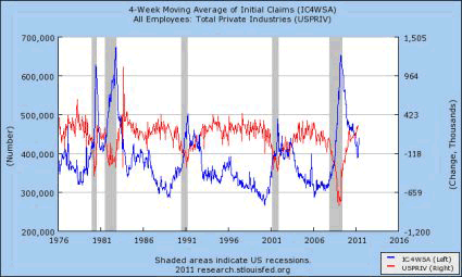
So why is the 400,000 level so significant? The next graph shows why. Historically that has been the inflection point where the economy starts to add a lot of jobs. It layers over the monthly gain or loss in private sector jobs (red line, right hand scale) and total jobs (green line). Unfortunately the automatic scaling did not put a line at zero for the job growth line, so you will have to eyeball it a bit.
However, notice the strong inverse correlation between job growth and initial claims, and how when the blue initial claims number is below the 400,000 level that job growth is strong. OK, it is not that an increase from 399,000 to 400,000 is all that much difference than from 397,000 to 398,000 or from 402,000 to 403,000, but big round numbers are psychologically important, especially when that round number is near a historical inflection point.
Continuing Claims
The data on regular continuing claims sort of a non-event this week. Regular continuing claims for unemployment insurance fell by 1,000 to 3.711 million. The overall trend is strongly in the right direction. They are down by 974,000 or 20.8% from a year ago.
Regular claims are paid by the state governments, and run out after just 26 weeks (although several states have lowered the number of weeks they are going to pay in the future recently).
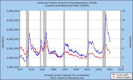
The next graph shows the long-term history of continuing claims for unemployment, as well as the percentage of the covered workforce that is receiving regular state benefits. It does a good job of showing just how nasty that the Great Recession was for the job market. It also shows how things at the regular state unemployment benefit level have been getting much better over the last year (but still well above the peaks of the last two recessions.
Note that the insured unemployment rate generally follows the direction of the number of claims, but has been gradually diverging over time. That is a function of the overall growth of the labor force, and of tighter eligibility standards for getting unemployment insurance over time. It also reflects the fact that this time around a very large proportion of those getting unemployment benefits are getting them from the extended Federal programs, not from the regular state programs.
In April, half of all the unemployed had been out of work for 20.7 weeks (down from a record high of 25.5 weeks in June, and down from 21.7 weeks in March), and 43.4% had been out of work for more than 26 weeks. Just for a point of perspective, prior to the Great Recession, the highest the median duration of unemployment had ever reached was 12.3 weeks near the bottom of the ’82-83 downturn.
Clearly a measure of unemployment that by definition excludes 43.4% of the unemployed paints a very incomplete picture. The number of short-term unemployed (less than 5 weeks) was actually on the low side. The problem in terms of employment is not a lot of firing, but a lack of hiring. This has been the case for some time now.
“Graduating” to Extended Benefits
After the 26 weeks are up, people move over to extended benefits, which are paid for by the Federal government. While regular claims are down, it is in large part due to people aging out of the regular benefits and “graduating” to extended benefits.
Unfortunately, the data on extended claims in prior recessions is not available at the St. Louis Fed database. However, given the extraordinary duration of unemployment, it is a safe bet that they are higher than in previous downturns. The duration of unemployment metrics are some of the key details to look at when the report comes out tomorrow.
The extended claims have also been trending down, but it has been a bumpy decline. They (the two largest programs combined) fell by 5,000 to 4.041 million this week. Relative to a year ago they are down 1.321 million or 24.6%.
A much better measure is the total number of people getting benefits, regardless of which level of government pays for them. This is particularly true when looking at the longer term, not the week to week changes. Combined, regular claims and extended claims (including a few much smaller programs) fell by 57,000 to 7.683 million on the week and are down 2.210 million or 22.3% over the last year.
(The extended claims numbers are not seasonally adjusted, while the initial and continuing claims are, so there is always little bit of apples-to-oranges. In addition, the continuing claims data are a week behind the initial claims, and extended claims are a week behind the extended claims data.)
Even with the deal that extended unemployment benefits for this year in exchange for continuing the top end of the Bush tax cuts, people will still “graduate” from the system after 99 weeks, but people will continue to be able to move to the next tier up to the 99 week limit.
Extended benefits are in four different tiers, so if benefits had not been extended, some people would have lost their benefits after just 39 weeks of being out of work. The key point, though, is that the year-long extension does not mean that some people will be getting benefits for a total of 151 weeks, as is sometimes thought.
Better, Still Bad
While the employment picture has improved a bit this year, in any absolute sense it is still just plain awful. The pace of improvement appears to be slowing significantly based on the initial claims data over the last few weeks. I find it astounding that aside from making political points, nobody in Washington seems to care anymore.
The one exception is the Federal Reserve, which is doing its part by keeping rates low and by using quantitative easing. While that helps a little bit, it is also much less effective than fiscal stimulus would be. Right now monetary policy is sort of “pushing on a string.” In any case, QE2 is going to end in June, and the likelihood of it being followed by QE3 is very low right now.
Some claim that the long duration of unemployment benefits has actually discouraged people from looking for work. That is, people are content to live forever on 60% of their previous income, or $400 per week, whichever is lower. The average benefit is only about $300 a week. Ask yourself how well could you live on $300 per week.
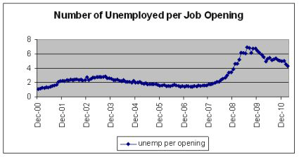
Right now (well as of the March JOLTS data) there are almost 4.3 people out of work for each job opening. Just telling all of them to “get a job” isn’t going to work. The extension of benefits is one of the key reasons that initial claims are falling. While that may sound counter-intuitive, it is because extended benefits are a very effective form of economic stimulus.
The graph below shows the ratio of jobless to job openings since the JOLTS data first started tracking job openings. As with so many other things, we are making progress and headed in the right direction, but the absolute level is still awful.
Extended unemployment benefits are, dollar of dollar, one of the most effective forms of economic stimulus there is. It is a pretty good bet that the people losing their extended benefits have depleted their savings and run up all the debt they can in trying to make ends meet. The maximum unemployment benefit works out to be just $20,800 per year, or less than the poverty line for a family of four. You think any of those people have been able to sock any of that away?
There is a concern that by cushioning the blow of unemployment, people might be more reluctant to take a marginal job opportunity, but a below poverty level income is not that much of a cushion. I’m not sure it is good for the economy for highly skilled people to be taking jobs in other fields that have no use of those skills, and then be unavailable when those skills are needed again.
The people who get extended benefits tend to spend the money quickly on basic needs. This in turn keeps customers coming in the door at Wal-Mart (WMT) and Family Dollar (FDO). It means that, at the margin, some people are able to continue to pay their mortgages and thus helps keep the foreclosure crisis from getting even worse than it already is.
However, by the time they are well into extended benefits, they might also be spending food stamps as well as the unemployment check at Kroger’s (KR). These customers keep the people at Wal-Mart, Family Dollar and Kroger’s, and of course their competitors, employed. It also keeps the people who make and transport those goods employed as well, although in that case much of the stimulus is lost overseas if the goods are imported.
There really is not good way to tell from this report if the decline in the number of people receiving benefits is due to them getting new jobs, or due to even the extended benefits running out. If it is the former, it is very good news. If it is the latter, it just means more people are falling into absolute destitution.
However, on a back of the envelope basis, if the total number of people getting benefits is down by 2.210 million, and we have only created 1.313 million jobs (as of April) over the last year, one can surmise that at least 897,000 have left the wrong way. That is not good news for either the economy or for social stability.
Discouraging, Not Unexpected
The 4-week average staying above the 400,000 level is a discouraging, but not unexpected, sign. In the last two recoveries, when it got below that threshold, that job creation really started to take off. If it stays there, we will climb the Stairway to Heaven of a rapidly falling unemployment rate. If it shoots above 500,000 then we are on the Highway to Hell.
The current level, if we stay here for a prolonged period of time, puts us back into the purgatory of a pseudo-recovery. The trend over the last four weeks makes it clear that we are no longer on that Stairway to Heaven, and seem to at least be looking for the entrance ramp to that Highway.
The decrease this week is encouraging, but the improvement was not as much as expected. This series can be volatile from week to week. The decline will need to continue in the weeks to come.
The continuing and extended claims numbers look much more promising, but only if people are leaving the rolls for the “right reason.” If they are leaving for the wrong reason, that the benefits have simply run out, the declines are not really good news (even if they do help reduce government spending), they are just a reflection of millions of people slipping into poverty. Hardly a thing to celebrate.
FAMILY DOLLAR (FDO): Free Stock Analysis Report
Disclaimer: This page contains affiliate links. If you choose to make a purchase after clicking a link, we may receive a commission at no additional cost to you. Thank you for your support!


Leave a Reply