This weekend I’m writing a draft of my new paper, “Biosciences and the Long-Run Economic Recovery.” Along the way I came up with three charts that I thought I’d share with you. I’m not going to put much gloss on these, because they are pretty much self-explanatory, and because I need to get back to the paper.
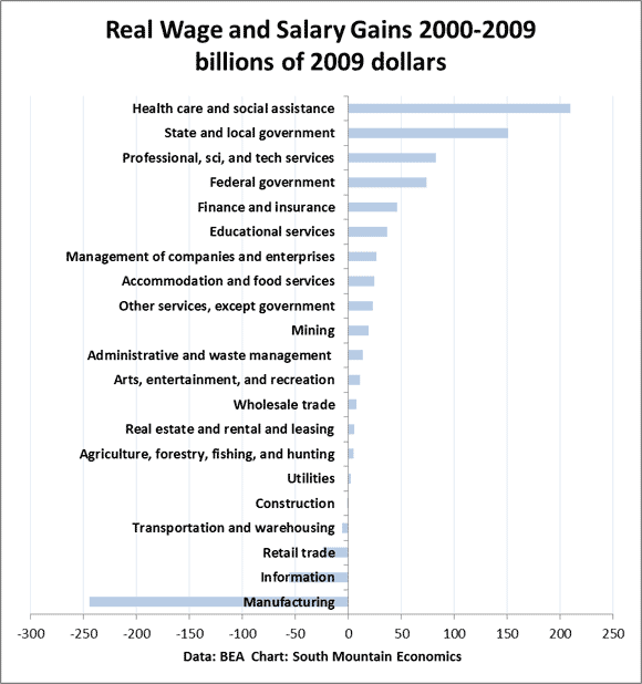
This first chart shows the change in wage and salary payments by major industry from 2000-2009, adjusted for inflation, using BEA data. We see that healthcare and social assistance generated $210 billion in real wage gains from 2000 to 2009 (all in 2009 dollars). Next biggest was state and local government, which generated $151 billion in real wage gains. (The exact numbers change a lot if I change the end dates, but the pattern stays the same).
On the other hand, the big losers were manufacturing (-$245 billion), information (-$56 billion), retail trade (-$24 billion), and transportation and warehousing (-$6 billion). It’s interesting that the industries in the global supply chain were the big losers in real wages, but I’m not sure quite what to make of it.

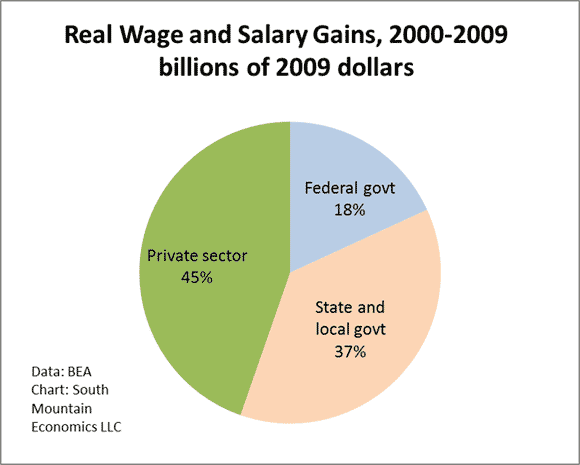
Now I’m going to take the same data and cut it by federal govt, state and local govt, and private sector. The short answer is that the public sector accounted for 55% of real wage gains between 2000 and 2009, while the private sector only accounted for 45%. Once again, this is not necessarily a surprise, but it’s still interesting.

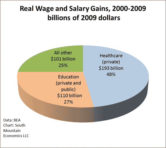
Now we get to the third chart (having fun with 3D pie charts–like it?). What we see is that health and education (public and private) accounted for an amazing 75% of real wage and salary gains between 2000 and 2009. The rest of the economy–only 25%. Make that what you will.


This is stunning to say the least. It is directionally heading towards a Soviet style economy without meaning to. In Canada I saw a related alarming stat in that the proportion of employees who are unionised has more than doubled in government jobs and dropped significantly in private. These are all trends that suggest unsustainability.