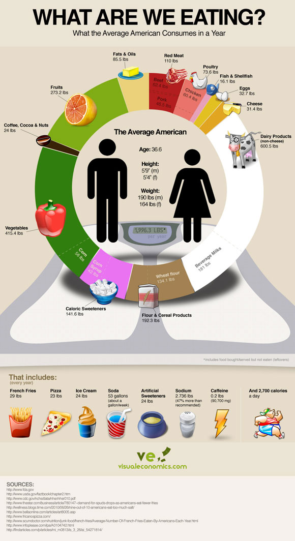
Visual Economics shows statistics on average food consumption in America:
My brief feedback is that water is confounded with these results. They should have subtracted water content from the weight of all dietary items, as it inflates the proportion of milk, vegetable and fruit items that contain more water. They did that for soda (which is represented as sugar/corn syrup), amplifying the inconsistency.
Time Magazine had a beautiful gallery that visualizes diets around the world in a more appealing way.
Andrew Gelman is a professor of statistics and political science and director of the Applied Statistics Center at Columbia University. He has received the Outstanding Statistical Application award from the American Statistical Association, the award for best article published in the American Political Science Review, and the Council of Presidents of Statistical Societies award for outstanding contributions by a person under the age of 40.
His books include Bayesian Data Analysis (with John Carlin, Hal Stern, and Don Rubin), Teaching Statistics: A Bag of Tricks (with Deb Nolan), Data Analysis Using Regression and Multilevel/Hierarchical Models (with Jennifer Hill), and, most recently, Red State, Blue State, Rich State, Poor State: Why Americans Vote the Way They Do (with David Park, Boris Shor, Joe Bafumi, and Jeronimo Cortina).
Andrew has done research on a wide range of topics, including: why it is rational to vote; why campaign polls are so variable when elections are so predictable; why redistricting is good for democracy; reversals of death sentences; police stops in New York City, the statistical challenges of estimating small effects; the probability that your vote will be decisive; seats and votes in Congress; social network structure; arsenic in Bangladesh; radon in your basement; toxicology; medical imaging; and methods in surveys, experimental design, statistical inference, computation, and graphics.
We use cookies on our website to give you the most relevant experience by remembering your preferences and repeat visits. By clicking “Accept”, you consent to the use of ALL the cookies.
This website uses cookies to improve your experience while you navigate through the website. Out of these cookies, the cookies that are categorized as necessary are stored on your browser as they are essential for the working of basic functionalities of the website. We also use third-party cookies that help us analyze and understand how you use this website. These cookies will be stored in your browser only with your consent. You also have the option to opt-out of these cookies. But opting out of some of these cookies may have an effect on your browsing experience.
Necessary cookies are absolutely essential for the website to function properly. This category only includes cookies that ensures basic functionalities and security features of the website. These cookies do not store any personal information.
Functional cookies help to perform certain functionalities like sharing the content of the website on social media platforms, collect feedbacks, and other third-party features.
Performance cookies are used to understand and analyze the key performance indexes of the website which helps in delivering a better user experience for the visitors.
Analytical cookies are used to understand how visitors interact with the website. These cookies help provide information on metrics the number of visitors, bounce rate, traffic source, etc.
Advertisement cookies are used to provide visitors with relevant ads and marketing campaigns. These cookies track visitors across websites and collect information to provide customized ads.

Leave a Reply