As we ponder the plight of the over-$250K household income group (see the poignant story here), I think it worthwhile to examine the unemployment and underemployment rates for lower-income households. In researching statistics for our book, The Lost Decades, Jeff Frieden and I stumbled upon this study by Andrew Sum and Ishwar Khatiwada, with Sheila Palma, of Center for Labor Market Studies at Northeastern University. They characterized the mid-2010 employment situation as “A Truly Great Depression Among the Nation’s Low Income Workers Amidst Full Employment Among the Most Affluent”.
We asked the authors for an update of their results, and they kindly obliged. Below, we present a graph of unemployment and underemployment rates, for the January – August 2010 period, conditional on household income in 2008.
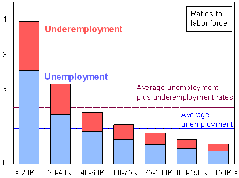
Figure 1: Unemployment rate (blue) and underemployment rate (red), for January-August 2010, based on household income in fourth quarter of 2008. Blue dashed line is average unemployment rate for entire sample; purple dashed line is average unemployment plus underemployment ratio for entire sample. Source: Calculations based on estimates provided by Andrew Sum and Joseph McLaughlin.
The authors also estimate a group that is marginally attached to the labor force, which might be thought of as discouraged workers.
…Our third labor market problem group consists of members of the so-called labor force reserve or overhang. These are individuals who were not actively participating in the labor force but who expressed a desire for immediate employment….
The authors note in footnote 10, “The labor force reserve should not be confused with the BLS concept of the marginally attached. The latter group are a subset of the labor force reserve who have looked for a job in the past year and were available to take a job.” We can recalculate the ratios as a share of (labor force+labor force reserve). This calculation yields the following graph.
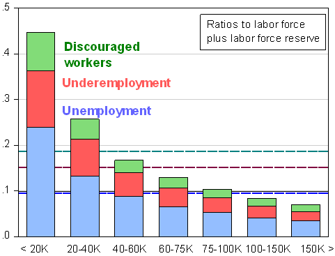
Figure 2: Unemployment (blue), underemployment (red), and labor force reserve (green) as ratio to sum of labor force and labor force reserve, for January-August 2010, based on household income in fourth quarter of 2008. Blue dashed line is average unemployment ratio for entire sample; purple dashed line is average unemployment plus underemployment ratio for entire sample; teal dashed line is average unemployment plus underemployment plus reserve ratio for entire sample. Source: Calculations based on estimates provided by Andrew Sum and Joseph McLaughlin.
The Incidence of Unemployment and Underemployment, by Income


Leave a Reply