High ratios of debt-to-GDP, usually accumulated by economic systems via aggressively financing growth with debt, are the most important factors influencing the outlook for near-term economic growth. These ratios contribute to the initiation and continuation of financial and economic crises, reflecting massive fiscal deficits and excessive borrowing by the private sector. High leverage and the tendency of overreliance on borrowing, diminishes the possibility of managing risk prudently, consequently leading to more debt accumulation.
The debt to GDP ratio in U.S. is in high range of 200 to 250% while the mortgage related debt to GDP is between 75 to 100%. Currently at the center of economic concerns is the massive U.S. debt and whether some form of resolution (if such a thing is still possible) can be adopted so that it can return to sustainable levels. But, leaving aside the fact that common sense suggests that the ratio of debt-to-GDP should not be allowed to rise year after year, and avoiding the question of how did we arrive to this point. The persisting dilemma now consists in the fact that once macroeconomic normalization and economic fundamental improvements reach again confident levels, in terms of supporting the rate of productivity growth to a higher scale, and as the ongoing financial crisis finally finds a bottom ; are our debt levels really as stretched as most people think they are?
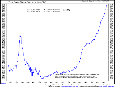
Credit Swiss’ [CS] debt strategists have a unique take on the subject . They put out Friday a new report [CS via Clusterstock] arguing that the famous chart showing debt-to-GDP ratio in the U.S. over the last 100 years, and used to justify extreme real economic bearishness on the basis of how disastrously overleveraged the U.S. private sector has become – “is both technically wrong, analytically meaningless – and arguably the most dangerous piece of propaganda to come out of the current crisis.”
Original 100 Yr Debt-to-GDP chart:
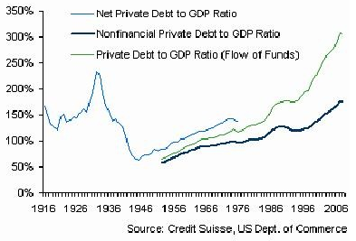
Here is the revised version and how it should look as opposed to Chart 1, which according to CS splices the two series together, using the higher number as the base:
Credit Swiss also points out in the report, with respect to the cost of servicing the debt, that with rates at historically low levels and with current servicing costs well below 10 and 20 year average ; the level of debt relative to servicing costs are reasonable. CS concludes its argument on the subject adding – that the real problems attributed to the aggregate household sector, regarding servicing costs, lie primarily with the failure of market and funding liquidity and a non-coordinative mechanism between securitisation and mark-to-market accounting principles.

excellent post
(1) Please consider the source. This report is also propaganda. The question is, what is the truth? Who is right?
(2) OK, I may not be a finanance genius, but isn’t CS saying that the cost of interest on the debt does not yet exceed the cash flow capacity of the debtors?
Would not the end result of this kind of this reasoning eventually result in people and entities using debt to pay for debt? Unless there is a great deal of growth, doesn’t the risk that cash flow falls behind the ability to serve the debt become compounded over time using this logic?
Unless I am 100% wrong, this report is a perfect example of the kind of flawed group think embedded in the big banking industry. The logic is based purely on a “model” based enitrely on mathmematics without regard to real world inputs. Real world inputs are markets, people, natural disaster, anything that cannot be reliably quantified.
Is it just me, or is there a disconnect between this theory and reality? Please, help me out.
JPGil
I am very suspicious of the CS analysis because they (the banking industry)are a big part of the cause of the problem. To put it in a micro-scale, I would be very suspicious of anyone who said that the ratio of my salary to the amount that I owed was meaningless, because credit card interest rates are at an all time low.
Pyramid schemes work, as long as everyone buys in. Theoretically, it just becomes a transfer of wealth between the players, and it grows as long as there are new players. As I see it, the problem with the world banking system is that there are large withdrawals from the system, and there is an imbalance between the percieved value of the pyramid (real estate, money, work) and a general loss of confidence between the big players. Of course CS will continue to tout the ‘system’ , because they have no other choice. The real unfortunate part is that the big players really don’t have any real value, and have been gambling with the life-savings of the little-guy. So everyone suffers, except the ‘smart’ big players that have pulled their money out of the system. I think that the international banking system needs to be over-hauled. As a world community, we should take a good hard look, any time that enormous wealth can be derived without a tangible product. Whenever this happens, someone/somewhere/sometime is getting the shaft. This has been going on for some time. Look out here it comes, now.
Please, where is the next chart where they say : Household debt has recently exceeded the levels of 1920s and it is only a recent problem.
So, it has reached a level that triggered Great Depression but it is not a big deal now?