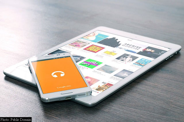
Internet usage worldwide is reaching new heights. The growing demand for 4G-enabled smartphones suggests that the traditional desktop screen and keyboard setups are slowly taking a backseat. Aside from the convenience of communicating while on the move, handheld devices such as tablets and mobile phones are now designed with features that were previously limited only to desktop computers. As a result, and for the first time ever globally, internet usage on mobile devices like smartphones and tablets now has surpassed desktop.
According to web analytics firm StatCounter, the Internet usage of mobile and tablet devices accounted for 51.31 percent worldwide in October, versus the 48.7 percent via desktop.
The growth of Internet usage by mobile devices in India is quite substantial, accounting for 78.05 percent, the desktop at 21.18 percent, while the tablet at 0.76 percent. Meanwhile, in the United States, Internet usage by mobile phone is at 42 percent, while in the United Kingdom is at 44.4 percent, which indicates that desktop computers remain the primary mode of Internet usage. It is apparent that the exponential increase in mobile devices has drastically changed Internet’s usage patterns. With the increasing reach of handheld devices, the race is now set on making web content more mobile-friendly.
“This should be a wake up call especially for small businesses, sole traders and professionals to make sure that their websites are mobile friendly. Many older websites are not,” commented Aodhan Cullen, CEO, StatCounter. “Mobile compatibility is increasingly important not just because of growing traffic but because Google favors mobile friendly websites for its mobile search results,” Cullen added, pointing out Google’s efforts in making web content more mobile-friendly.
Last year, Google started using mobile compatibility as a ranking indicator of mobile searches. Starting May of this year, the search giant added updated mobile search result that augments the ranking indicator to help users find relevant webpages that are mobile-friendly. Google also introduced an online tool ‘Test My Site’ that enables users to test how well the site works across mobile and desktop platforms, as well as AMP, an Accelerated Mobile Pages Project, which is an open-source initiative that helps publishers create mobile-optimized web content that is easy to load.
The increased mobile Internet usage is a significant milestone as it indicates how handheld devices have become the primary entry point to the Internet. For many decades, desktop was the conduit that connects users online. But the convenience of communicating on-the-go, anytime of the day, and with all the world’s information at everyone’s fingertips gave mobile devices technological benefits over desktop computers. These advantages along with the improvement of 4G LTE Internet speeds, faster handheld devices made thinner and lighter allowed smartphones and tablets to easily become the device of choice by many in recent years. But, desktop still plays a significant role in the digital world, and they will not be phased out anytime soon.


Leave a Reply