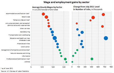
In the wake of the July employment report released last week, an interesting graphic appeared in a Wall Street Journal article with the somewhat distressing title “Low Pay Clouds Job Growth.” The graphic juxtaposed average wages by sector (as of July 2013) with changes in the numbers of jobs created by sector (from July 2011 through July 2013). I’ve reproduced that chart below, with a few enhancements:
(click to enlarge)
For the 17 sectors, the red circles represent the five sectors with the lowest average wage as of July. The green circles represent the five sectors with the highest average wages, and the blue circles represent those with average wages between the high and low groups. The size of each of the circles in the chart represents the share of employment in that sector during the July 2011 to July 2013 period.
The clear implication of the article is that things are even worse than you think:
Employers added a seasonally adjusted 162,000 jobs in July, the fewest since March, the Labor Department said Friday, and hiring was also weaker in May and June than initially reported. Moreover, more than half the job gains were in the restaurant and retail sectors, both of which pay well under $20 an hour on average.
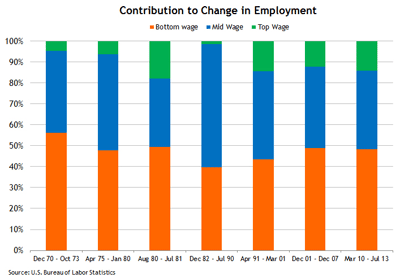
That situation may indeed be something worth worrying about, but if so it is nothing new. The following chart shows the percentages of job gains sorted by low-wage, middle-wage, and high-wage sectors for each of the U.S. expansion periods dating back to 1970:
(click to enlarge)
I’ve dated the current recovery from March 2010: the month that employment gains turned positive. It should also be noted that the cross-recovery comparisons are not quite apples-to-apples given changes in the way sectoral employment is reported by the U.S. Bureau of Labor Statistics. (There are only 11 sectors, for example, in the recovery periods prior to 1991.)
But I don’t think this materially alters the basic picture: The lowest-wage sectors have consistently produced 40 percent to 50 percent of the job gains in recent recoveries. Though the percentage was slightly higher in July, it was not materially so. And this recovery does not look at all unusual when taken as a whole.
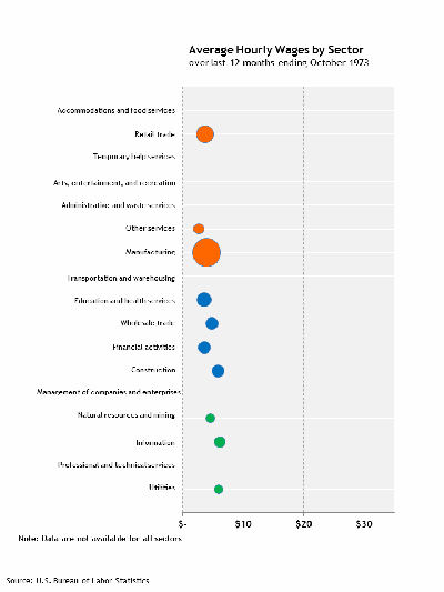
What is more striking—at least relative to the earlier recoveries in the chart—is the growing disparity between the average wages across sectors, as this animation clearly illustrates:
(click to enlarge)
Importantly, the animation also clearly illustrates that the growing wage disparity is a trend, not a unique feature of the postcrisis period. There are lots of interesting things being written about the reasons for this trend, and it is a vitally important topic. But I’m pretty sure the answers to the important policy questions lie well beyond the current business cycle.


Leave a Reply