I keep running across blog posts showing the inequality of income and wealth in America. In a recent post I already discussed one reason why this data is fatally flawed, capital income is nothing like wage income—rather it is deferred consumption. Counting capital income and wage income is actually counting the same income twice. Here I’d like to discuss some other problems with the data:
1. Life cycle effects: I dragged out my annual Social Security data that I get in the mail, and it shows how much I earned during each year. I tried to do a rough adjustment for cost of living changes, to make things fairer (otherwise my income looks extremely unequal.) I am pretty sure my five income “quintiles” are roughly as follows: 3%, 13%, 22%, 27%, and 35%. In other words during my worst 7 years I made 3% of my total real lifetime income, and during my best 5 years about 35%. Some people have a more equal profile, whereas others have a far more unequal profile. I think I’m probably not that atypical. The point is that if we had 100% lifetime equality in earnings, but wages that rose with age and experience, then that’s the sort of income inequality we might observe in America. The actual income inequality is greater, because inequality is not just due to life-cycle effects.
2. Inflation: Suppose you are the richest guy in the world, owning $100 billion in Microsoft stock. You cash out and decide to live off the interest. To avoid inflation risk, you put it all in 10-year indexed TIPS. You would earn $650,000,000 per year in interest. Unfortunately your tax liability would be more than $650,000,000. The government would report your income as about $2 billion. So the person who might well have the highest reported income in the entire country according to official data, might not have any real income at all. Now obviously most rich people don’t put all their money in TIPS. They take bigger risks and get positive rates of return. But risk implies the possibility of loss. Some do much worse than the hypothetical I gave you. Of course even with no income a person this rich has a fabulous lifestyle, which is what I would argue is exactly the point. Look at consumption inequality, not income inequality.
3. I am pretty sure that a lot of the wealth inequality data is incomplete. I recall reading that it often ignores structures (which is much of the wealth for average homeowners and shopkeepers.) It may ignore pensions. Many retired public employees have defined benefit pensions that would be hard to replicate with a 401k holding a million dollars. It ignores human capital, making it impossible to compare human capital-rich brain surgeons and lawyers, with physical capital-rich farmers and landlords.
4. Income inequality data is often collected at the household level, implying that a doctor making $250,000 with a stay at home spouse is no better off that a Boston cop making $150,000 (including lots of overtime) married to a nurse making $100,000 (including lots of overtime.) But the two income couple might have to spend money on child care, and have very stressful lives doing household chores on top of their paid jobs. This isn’t a major bias, but many people who naively think of the top quintile as being “rich” would be shocked at how many working class couples in their 40s or 50s who are dual income and live in high cost areas like NYC and Boston actually fall into that category. I’d guess two married people each making $55,000 would make it the top quintile, and I’d guess a couple who each make $75,000 would make the top decile. Those aren’t gaudy incomes around here.
I am not trying to argue the upper middle class can’t afford to pay more taxes. (I don’t want to get mauled like that poor U of C professor.) Indeed, I think most Americans could afford to pay much more taxes, as we’ve become used to having lots of stuff we really don’t need. A small Hyundai will get us from A to B just as well as a Lexus. So that’s not the point.
Instead, my point is that we should ignore all the official data, and use our eyes. Travel around the country. Go into poor people’s houses. In the 1970s I recall staying with a rural family of six in a small house who had running water for only a couple hours of the day. Over the course of my life I’ve seen lots of poor urban and rural neighborhoods. And I’ve driven around affluent areas like Newport Beach and Wellesey, and very rich areas like Beverly Hills. I don’t really know what’s it’s like to be poor in a cultural sense, or not be able to afford food for my family, but I think I do have a rough sense of the different sorts of consumption bundles purchased by different classes of people. For what it’s worth, here’s my impressions:
1. All classes in America are better off than in the 1960s. But the gains are most noticeable for the poor and rich. Especially the poor in the rural South.
2. The US has more inequality than other developed countries.
3. Some income redistribution should occur, via a progressive consumption tax and subsidies for the poor (wages subsidies, disability subsidies, HSA subsidies, education vouchers, etc.)
So I don’t have any objection to policies of redistribution, which is what motivates all these comparisons. But it annoys me that people are making arguments using worthless data. Here’s an example of a graph I found in a Matt Yglesias post:
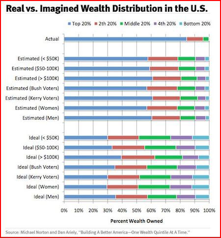
It shows wealth inequality by quintile, using data that is utterly meaningless, then shows wealth inequality as perceived by the average American. Here you are supposed to laugh at the stupidity of Americans. But their view may actually be closer to the truth than the official data. Then the graph shows the inequality that Americans think would be fair. Even the Bush voters opt for a wealth distribution far more equal than what we actually have.
Here’s the problem with this entire enterprise. Let’s work with the wealth definition that was probably used in this table, that is, only easy to measure financial assets. Assume this data is correct. How much income equality would we need to get things as equal as the Bush voters want? I’m going to claim that even 100% income equality would not be enough. That’s right, if you paid a 16 year old boy with pimples at McDonalds exactly the same income as a brain surgeon at Mass General, measured wealth in America would still be far more unequal that what Bush voters say we should aim for. That makes Bush voters to the left of Mao, almost at Pol Pot levels of egalitarianism. And the reason is simple. Even with exactly equal incomes, people will vary greatly in how much they save, and how well they invest what they do save. So even with equal incomes, some would become very wealthy, and some would save almost nothing.
With apologies to Bentham, income inequality data is nonsense, and wealth inequality data is nonsense on stilts. It’s all about consumption.
Yglesias’ post was entitled “Poor People Are Much Poorer Than You Think.” Actually, if you are an observant person, and ignore the data, economic inequality in America is exactly what you’d think.
- Bulenox: Get 45% to 91% OFF ... Use Discount Code: UNO
- Risk Our Money Not Yours | Get 50% to 90% OFF ... Use Discount Code: MMBVBKSM
Disclaimer: This page contains affiliate links. If you choose to make a purchase after clicking a link, we may receive a commission at no additional cost to you. Thank you for your support!

I have rarely seen a worse article. The entire piece is replete with unsupported guesswork, because you don’t like the data provided by surveys, studies, actuarial analyses, and Nobel prize winning economists. A bunch “I think I read” and “this is probably” and “I think the data” etc.
Your first point – that life cycle and hence relative age affects the data. Newsflash: the ages of Americans are broadly diverse, and even where Boomers are a larger minority, they fall into all income quintiles.
You’re a tool. The last line says it all: “Actually, if you are an observant person, and ignore the data, economic inequality in America is exactly what you’d think.” Yeah, if you ignore the data and choose to see what you want the world is wonderfully ego-boosting.
Oooooo, so the poor now have access to running water for more than a few hours a day.
It’s not what you have that matters; it’s what the other guy has that matters. If greed is allegedly good, then so is envy.
If you only have a piece of crap 2 year old Lexus and $1MM in assets but your neighbor has a shiny brand new Bentley and $10MM in assets; you’re poor.