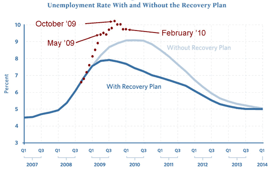
I had occasion to revisit this graph:

And then, it suddenly struck me: what if everything had gone as planned? From the perspective of Obama’s reelection chances, the light blue graph (“without recovery plan”) is much better than the dark blue (“with recovery plan”). By Election Day, 2012, the two curves are nearly at the same point. But in the year from 2011 to 2012, the economy is improving much faster with the top curve than the bottom curve. And, as Doug Hibbs, Bob Erikson, Steven Rosenstone, and others have taught us, year-to-year change in the economy is what it’s all about.
I’m not exactly saying that Obama and his team actually want unemployment in 2011 to be any higher than necessary; it’s just funny how, from a crude curve-extrapolation perspective, the above graph is looking like it could be good news for them in two and a half years.
Once again, it’s the Hoover-or-Reagan story.
- Bulenox: Get 45% to 91% OFF ... Use Discount Code: UNO
- Risk Our Money Not Yours | Get 50% to 90% OFF ... Use Discount Code: MMBVBKSM
Disclaimer: This page contains affiliate links. If you choose to make a purchase after clicking a link, we may receive a commission at no additional cost to you. Thank you for your support!


Leave a Reply