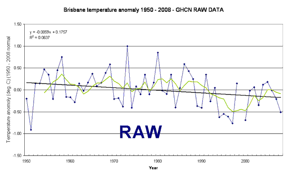
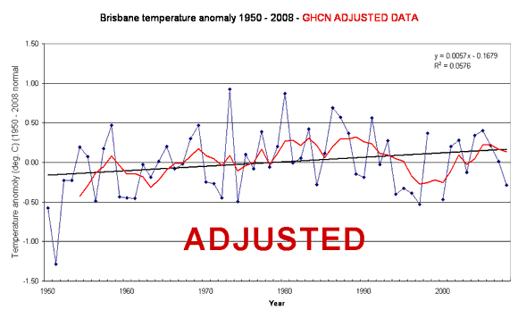
Just after the expose of unjustified adjustments (always upwards) in Oz data, a Brisbane resident took a look at the raw data at his local airport and how the ClimateGate Cabal has manipulated it. This animated chart shows the fraud. His take:
As you can see the raw data shows a downward trend of about -0.6 C per century. The unadjusted data however shows an opposite trend of +0.6 C per century. Intuitively as the airport grew from a quiet strip to a busy international jet airport one would think the more recent data would be adjusted downwards for the heat island effect. Instead we see that the data prior to 1978 is adjusted down and the data in recent times was adjusted up.


Leave a Reply