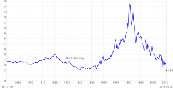
If I am reading this graph correctly, we are at a 130 year record:

Those bond vigilantes sure are being vengeful. And how about that S&P downgrade?
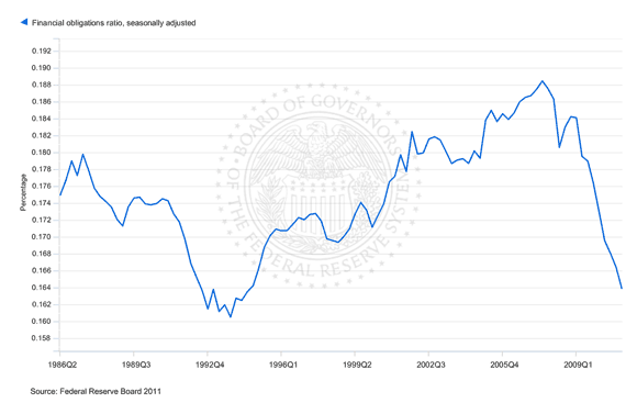
The good news graph of the day, though, comes from the Fed:

This is the average financial obligation ratio, which is debt service plus rent over disposable income. Lower interest rates do seem to be helping, although it would be useful to know what has happened to the median, as opposed to average, household. I refinanced my mortgage earlier this year, and it was great, and meant my financial obligation ratio fell by ten percent or so. But underwater borrowers who can’t refinance (or households whose income fell enough to precent qualification for a new mortgage) may be worse off than before. It is hence possible that while the average has improved, the median has not.
- Bulenox: Get 45% to 91% OFF ... Use Discount Code: UNO
- Risk Our Money Not Yours | Get 50% to 90% OFF ... Use Discount Code: MMBVBKSM
Disclaimer: This page contains affiliate links. If you choose to make a purchase after clicking a link, we may receive a commission at no additional cost to you. Thank you for your support!


Leave a Reply