There might seem to be some conflicting signals from Friday’s employment report from the Bureau of Labor Statistics. But I see a uniform message in the various numbers– the economic recovery remains disappointingly weak.
The BLS reports data from two different sources. The first source is a survey in which individual establishments are asked how many people are employed at that establishment. According to this survey, the number of people employed increased on a seasonally adjusted basis by 103,000 in December, a disappointing number given the needs of so many people to find work. A silver lining was that the November gain, originally reported as only 39,000, was revised up to a now-estimated gain of 71,000 jobs, and the October gain, which last month was estimated to be 172,000, was revised up to 210,000. If good news comes in threes, the December numbers could end up being favorably revised as well. As currently reported, the average over the last three months would be 128,000 net new jobs each month.
A second data source used by the BLS is a survey of individual households, in which residents are asked whether or not they are working. According to this survey, 297,000 more Americans were working in December than in November on a seasonally adjusted basis. The household survey is also the basis for the BLS estimate of the unemployment rate, which fell from 9.8% in November to 9.4% in December. We haven’t seen that big a 1-month drop in the unemployment rate since 1998. So maybe the establishment numbers were erring on the pessimistic side?
Unfortunately, the household numbers look much less rosy when you look at them a little more closely. For one thing, the impressive December gain comes right after an estimated loss according to the household survey of 175,000 jobs in November and a whopping loss of 294,000 in October. How can the household survey be signaling a falling unemployment rate over the last 3 months if its measure of the number of people working has actually gone down?
To answer that question, let’s take a look at how the BLS summarizes the responses people give to the household survey. They count as employed someone who did any work at all as a paid employee or worked in their own business during the surveyed week, and also people who have a regular job but missed work due to temporary factors such as illness or labor disputes. To be counted as “unemployed”, the person must not meet those first criteria and also must have made specific efforts such as contacting potential employers during the last 4 weeks to try to find a job. Any member of the civilian noninstitutional population over age 16 who doesn’t fall into one of the above two categories is designated to be “not in the labor force.” In December, 58% of the eligible population were employed, 6% were unemployed, and the remaining 36% were classified as not in the labor force.
Let me use an average over the last two months to smooth out some of the wild volatility in the household employment numbers and highlight what’s changed in terms of people’s employment status. In November and December, the civilian noninstitutional population over age 16 increased by 180,000 per month. The figure below illustrates what would have happened if these new people had entered into the respective employment categories at the same rate as the existing population. For example, if 58% of those 180,000 new potential workers found jobs, the number of employed individuals would have increased by 105,000 each month. If in December the number of employed had increased by 105,000, the number of unemployed increased by 11,000, and the number not in the labor force by 64,000, then measures such as the unemployment rate and the labor force participation rate would have been unchanged.
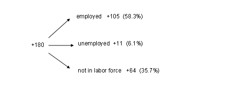
Average additions (in thousands of people per month) that would have kept the unemployment rate, employment rate, and labor force participation rate unchanged between October and December.
But we know that in reality, the unemployment rate was not unchanged, but fell from 9.7% in October to 9.4% in December. The figure below shows that this is attributable mathematically to the fact that almost 200,000 fewer workers were counted as being unemployed in December compared with October.
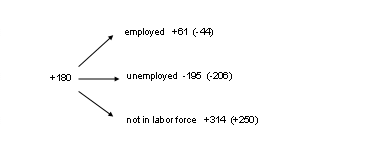
Actual average monthly changes in November and December in the number of people in different employment categories, with the actual change minus the change predicted in the previous figure indicated in parentheses.
We can also calculate the difference between what actually happened and the hypothetical values that would have kept the unemployment rate constant. Those numbers are reported in parentheses in the figure above. None of the drop in the number of unemployed over the last two months is due to an increase in the number of people with jobs. In fact, according to the household survey measures, there were 44,000 fewer new jobs per month than were needed to accommodate the growing population, let alone to provide work opportunities for those currently unemployed. The big move was from people who used to be counted as “unemployed” but are now designated as no longer in the labor force.
The next figure provides some long-term perspective, plotting the count of those not in the labor force as a percentage of the eligible population; (this is the same as 100 minus the labor force participation rate). There was a steady decline in the percentage of those not in the labor force during the 1970s and 1980s, owing largely to increased employment rates for women. That trend started to reverse over the last decade, with a sharp increase in nonparticipation rates coming out of the last recession. It’s that increasing tendency to drop out of the labor force that accounts for an improving unemployment rate in the face of quite weak job growth.

Percentage of the civilian noninstitutional population over age 16 that is designated as not in the labor force, 1948:M1 to 2010:M12. Data source: FRED (series CLF16OV and CNP16OV).
And, given the circumstances in which we’re seeing people dropping out of the labor force, it’s hard to greet the decrease in the unemployment rate as good news; see Justin Lahart and Calculated Risk for more discussion. The household survey thus in my mind confirms the inference from the establishment survey: this is still a much weaker job market than we want and expect for this phase in the recovery.
Interpreting the employment numbers
- Bulenox: Get 45% to 91% OFF ... Use Discount Code: UNO
- Risk Our Money Not Yours | Get 50% to 90% OFF ... Use Discount Code: MMBVBKSM
Disclaimer: This page contains affiliate links. If you choose to make a purchase after clicking a link, we may receive a commission at no additional cost to you. Thank you for your support!

jobless numbers comin out in next few months are gonna be pretty ugly to say the least, they’re gonna have to water the numbers down even more just to keep it under 10, 11%
What worries me the most is that the companies are starting to reject job applicants who are unemployed. The government should do something about it. IMO, these discriminating practises are worse for the economy than racist tendencies in recruitment. I stress out once more that “for the economy” because companies should be the first line in the fight against long term unemployment and should be properly encouraged to seek out the longer unemployed.