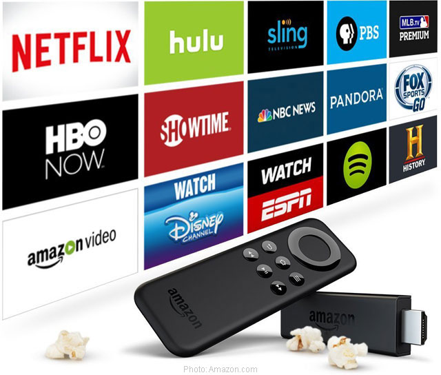
In addition to Apple (NASDAQ:AAPL), Google-parent Alphabet, Inc (GOOGL:NASDAQ), and Roku, Amazon.com (NASDAQ:AMZN) offers streaming TV devices, and the Fire TV Stick is amongst the most popular. Not only is it the cheapest streaming device in the market, it is also a portable device that allows outdated TV sets to stream movies online without buying a new one. But even with its features, Fire TV streamers find the gigantic selection of movies and TV shows outmoded. Having well over 7,000 apps, channels, games and other features, the older interface of Amazon Fire TV might be too overwhelming to users. And it is for that reason Amazon is releasing a new user interface for Fire TV and Fire TV Stick streamers.
The most significant change, by far, to the Fire TV user interface since its debut in April 2014 is the side-scrolling carousel dividing the categories. The new UI shifted the categories to the top, and reduced the number of category labels, allowing users to see larger previews of new TV shows, movies, apps, and games, which can now be scrolled sideways to see other headlines.
Realizing that Fire TV users are more likely to watch a show if they see a sample of it first, the hero image is updated to move like a trailer. Hero contents will also be based on what streamers have been watching.
The hero slider still has the same categories: “Movies,” “TV Shows,” “Apps,” and “Settings” in the switcher, along with the recently added “Your Videos” which solves the most frequently reported complaint sent by users. In Amazon’s new UI Fire TV, users can easily determine whether the content is free or paid. There is a “Prime Video” label that distinguishes its own movies and shows included in the subscription. In addition to that, “Your Videos” tab shows all of the user’s subscriptions, including third-party content providers.
UI Design
The new user interface has re-designed side-scrolling categories below the hero bar which shows view history and favorite apps. The rest of the rows will stay on-screen while scrolling, and users can easily scroll up and down, and side-to-side, which is much like Netflix (NASDAQ:NFLX) on Apple TV. There is also a “Customers Also Watched” section, along with suggestions by director or actor. Information about individual actors from IMDb will also be provided, including a brief biography, links to details, and a selection of movies across different online streaming providers.
The customizable games, news, and social media page are located in the “My Apps & Games” portion. Amazon also added a new “Voice View” function that reads out the user interface, a feature most beneficial to visually impaired streamers. By the way, Alexa, Amazon’s voice-enabled virtual assistant, is more powerful in the new Amazon Fire TV UI. Users can bypass button-presses by simply asking Alexa to search movies and TV shows, load streaming selection apps, and start playback.
Amazon has yet to announce the date when the new interface will be released. However, it confirms that the new update will be available for all Amazon Fire TV users for free by the end of 2016.
- Bulenox: Get 45% to 91% OFF ... Use Discount Code: UNO
- Risk Our Money Not Yours | Get 50% to 90% OFF ... Use Discount Code: MMBVBKSM
Disclaimer: This page contains affiliate links. If you choose to make a purchase after clicking a link, we may receive a commission at no additional cost to you. Thank you for your support!


Leave a Reply