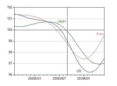
A month ago, I examined the information content of the OECD’s Composite Leading Indicators. The August release (for June data) is out. There’s substantial variation in the implied outlook across economies.

Figure 1: Normalized Composite Leading Indicators for US (blue), euro area (salmon) and Japan (green). Above 100 indicates expansion, below contraction. Dashed line at 2008M09, at the financial crisis. Source: OECD.

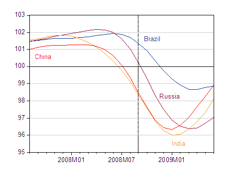
Figure 2: Normalized Composite Leading Indicators for Brazil (dark blue), Russia (purple) and India (yellow) and China (orange). Above 100 indicates expansion, below contraction. Dashed line at 2008M09, at the financial crisis. Source: OECD.
The documentation for the CLI are here, while an econometric evaluation of the CLI by Fichtner, Reuffer and Schnatz is here.
Notice that indeed things are looking up in the BRICs (Brazil, Russia, India, China), with perhaps the exception of Russia. Or, more accurately, things are looking less bad in those countries.
To keep things in perspective, 2008 US GDP (evaluated at market exchange rates) was about 23.5% of world GDP (all ratios from April 2009 IMF World Economic Outlook database), while these three economies in aggregate accounted for 54% of world GDP. The BRICs accounted for 14.6%. China is 7.3% of world GDP, so even with growth resuming, something else will be needed to get world growth back to near normal rates [1].
Update: Interestingly, Japanese GDP has surged into the positive, ahead of the CLI; while not unexpected, there is a question whether the growth is sustainable.
Leading Indicators: Key Economies and the BRICs
- Bulenox: Get 45% to 91% OFF ... Use Discount Code: UNO
- Risk Our Money Not Yours | Get 50% to 90% OFF ... Use Discount Code: MMBVBKSM
Disclaimer: This page contains affiliate links. If you choose to make a purchase after clicking a link, we may receive a commission at no additional cost to you. Thank you for your support!


Leave a Reply