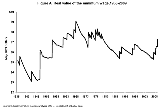
Here is a chart from the New York Times that shows the real value of the minimum wage over time.

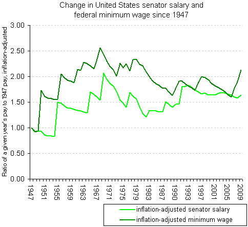
And here’s another one that proves that Congress cares more about poor workers than themselves. It shows the difference between inflation adjusted senators pay and inflation adjusted minimum wage.

And from the article here is your lesson in statistics for the evening.
Of course, this comparison doesn’t tell the whole story, given that American lawmakers get very generous benefits, including health care and pensions. Plus, if you start from a different base year, you’ll get a totally different story. If you use 1968 as your base year, for example, you’ll find that the inflation-adjusted minimum wage has declined 17 percent, whereas senators’ salaries have increased 7 percent. (I arbitrarily used 1947 as a base year simply because the Economic Policy Institute had the inflation-adjusted numbers readily available as far back as that year.)
Lies, damned lies, and statistics, right?
- Bulenox: Get 45% to 91% OFF ... Use Discount Code: UNO
- Risk Our Money Not Yours | Get 50% to 90% OFF ... Use Discount Code: MMBVBKSM
Disclaimer: This page contains affiliate links. If you choose to make a purchase after clicking a link, we may receive a commission at no additional cost to you. Thank you for your support!


Leave a Reply