America’s health-care system differs from its counterparts in other affluent nations in a number of ways: greater fragmentation among payers and price-setters, stronger incentives for overuse of advanced diagnostic and treatment technology, higher administrative costs, less access to care for some. We might therefore expect it to perform less efficiently — to achieve poorer health outcomes for a given amount of expenditure (see here, here, here).
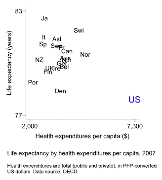
The following chart is sometimes viewed as evidence in favor of this hypothesis. The chart plots life expectancy at birth by per capita health expenditures as of 2007. Twenty affluent nations are included. Among these countries the U.S. spends by far the most money on health care and yet has the lowest life expectancy.

The inference is problematic, however, because America differs from the other countries in a number of ways that may affect health outcomes. It has a higher murder rate. It has more obesity. The U.S. population is more spatially dispersed than those of most other countries, so rural residents may live farther away from medical providers. Given these and other differences, how confident can we be that health spending is less effective in the U.S. than elsewhere?
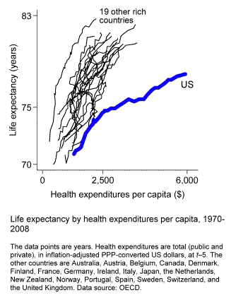
Here’s a better way to compare. This chart shows trends in life expectancy by trends in health spending from 1970 to 2008.

The United States still stands out, and in a big way. In every one of these countries rising health spending initially is associated with large increases in life expectancy, up to expenditures of about $500 per person and life expectancy of around 74 or 75 years. After that, the trendlines remain positively sloped but the payoff per dollar of extra spending diminishes somewhat. In nineteen of the twenty countries the slope settles at 2 or 3 years of added life expectancy for each additional $1,000-per-person of health expenditures. The U.S. is a stark exception. Our gain slows to just 0.75 years for each additional $1,000 per person.
The advantage of analyzing country differences in change is that it takes constant nation-specific factors out of play. It’s not a foolproof analytical strategy, but it reduces the likelihood of mistakenly inferring causation from correlation.
What we need to be wary of is life expectancy depressors that may have increased more or decreased less in the U.S. than in the other countries. Are there any? Not smoking: our rate of decline is in the middle of the pack. Not homicide: it’s decreased more here than elsewhere. Probably not spatial dispersion: Americans began moving back into cities in recent decades. One possibility, though, is obesity. Not only is it more prevalent here; it’s also increased more.
This kind of analysis is by no means conclusive. Life expectancy and total spending are highly aggregated indicators; it’s important to also examine more fine-grained measures of health care effort and outcomes (see here, here, here). But to the extent we treat the aggregate patterns as informative, a comparison of changes over time, rather than of levels, is likely to be our most valuable guide.
- Bulenox: Get 45% to 91% OFF ... Use Discount Code: UNO
- Risk Our Money Not Yours | Get 50% to 90% OFF ... Use Discount Code: MMBVBKSM
Disclaimer: This page contains affiliate links. If you choose to make a purchase after clicking a link, we may receive a commission at no additional cost to you. Thank you for your support!


Leave a Reply