There’s been a lot of happy talk recently about the revival of U.S. manufacturing . According to an article in the New York Times, “manufacturing has been one of the surprising pillars of the recovery. “ In a Forbes.com column entitled “Manufacturing Stages A Comeback,” well-known geographer Joel Kotkin talks about “the revival of the country’s long distressed industrial sector.” The Economist writes that “against all the odds, American factories are coming back to life.”*
Truly, I’d like to believe in the revival of manufacturing as much as the next person. Manufacturing, in the broadest sense, is an essential part of the U.S. economy, and any good news would be welcome.
Unfortunately, the latest figures do not back up the cheerful rhetoric.
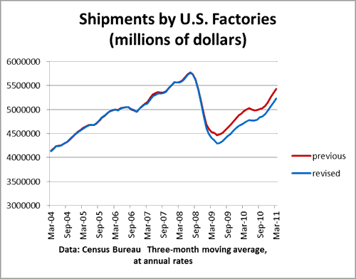
Newly-released data suggest that the manufacturing recession was deeper than previously thought, and the factory recovery has been weaker. On May 13 the Census Bureau issued revised numbers for factory shipments, incorporating the results of the 2009 Annual Survey of Manufacturers. The chart belows shows the comparison between the original data and the revised data (three-month moving averages):

The decline in shipments from the second quarter of 2008 to the second quarter of 2009 is now 25%, rather than 22%. And the current level of shipments in the first quarter of 2011 is now 9% below the second quarter of 2008, rather than only 5%. In other words, the new data shows that factory shipments, in dollars, are still well below their peak level.
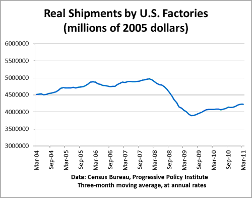
The manufacturing recovery looks even more tepid when we adjust shipments for changes in price. Here are real shipments in manufacturing, deflated by the appropriate producer price indexes.**

Now that hardly looks like a recovery at all, does it? Real shipments plummeted 22% from the peak in the fourth quarter of 2007 to the second quarter of 2009. As of the first quarter of 2011, real shipments are still 15% below their peak. To put it another way, manufacturers have made back only about one-third of the decline from the financial crisis.
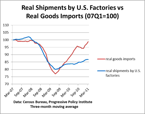
And while U.S. manufacturers have struggled, imports have coming roaring back. Here’s a comparison of real imports (data taken directly from this Census table) and real U.S. factory shipments (my construction, using Census and BLS data).

This chart shows that imports have recovered far faster and more completely than domestic manufacturing. Goods imports, adjusted for inflation, are only about 1% below their peak. That’s according to the official data. If we factored in the import price bias, we would see that real imports are likely above their peak (I’ll do that in a different post).
In other words, this so-called ’revival of U.S. manufacturing’ seems to involve losing even more ground to imports. That doesn’t strike me as much of a revival.
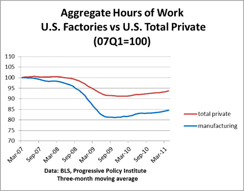
P.S. Oh, oh, what about all those manufacturing jobs that Obama’s economists are so proud of? This chart plots aggregate hours of manufacturing workers against aggregate hours in the private sector overall (the last point is the average for the three months ending April 2011).

What we see is that the decline in hours in manufacturing was deeper than the rest of the private sector, and the recovery has really not made up that much ground. Over the past year, aggregate hours in the private sector have risen 2.3%, while aggregate hours in manufacturing have risen 2.9%. That’s not much of a difference. In fact, probably the best we can say is that manufacturing has not held back the overall recovery.
*An important exception to the happy talk has been the recent report from the Information Technology and Innovation Foundation, entitled The Case for a National Manufacturing Strategy.
**For those of you interested in technical details, I used the producer price indexes for 2-digit manufacturing industries, as reported by the BLS. Could these estimates be improved on? Probably–but they are good enough to get the overall picture.
- Bulenox: Get 45% to 91% OFF ... Use Discount Code: UNO
- Risk Our Money Not Yours | Get 50% to 90% OFF ... Use Discount Code: MMBVBKSM
Disclaimer: This page contains affiliate links. If you choose to make a purchase after clicking a link, we may receive a commission at no additional cost to you. Thank you for your support!


Leave a Reply