I usually don’t like graphs with lots of lines, but this one is too important to pass up.

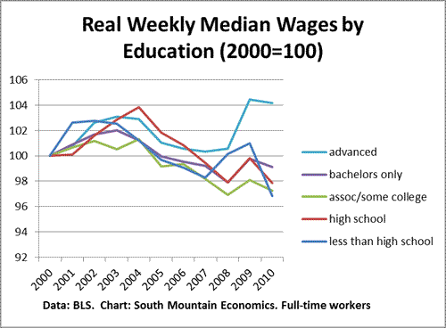
This chart shows median weekly wages for full-time wage and salary workers, adjusted for inflation, and indexed to 2000 (the data comes from the BLS ”usual weekly earnings” series). There are three things to take away from this chart.
*First, the wage gap between holders of advanced degrees and everyone else widened in 2010.
*Second, workers with advanced degrees have done much better than everyone else over the medium run, both since 2000 and since the Great Recession started in 2007. For example, since 2007, real weekly wages for advanced degree holders have risen by 3.8%, compared to a 0.1% decline for holders of bachelor’s degrees only.
*Third, over the past ten years, the pay for a bachelor’s degree has more or less tracked the pay for high school grads.
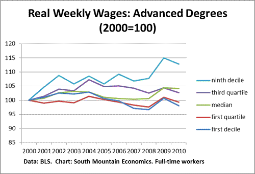
Now, within advanced degree holders, the pay inequality has widened as well. Take a look at this chart. The top decile–that is, the dividing line between the top 10% of advanced degree holders and everyone else–has risen 13% over the past ten years. The median and the third quartile (top 75%) has risen by 3-4%, while the bottom 25% of advanced degree holders is actually down since 2000.

- Bulenox: Get 45% to 91% OFF ... Use Discount Code: UNO
- Risk Our Money Not Yours | Get 50% to 90% OFF ... Use Discount Code: MMBVBKSM
Disclaimer: This page contains affiliate links. If you choose to make a purchase after clicking a link, we may receive a commission at no additional cost to you. Thank you for your support!


Leave a Reply