These may well be the most depressing set of graphs that I have seen in a long time. They’re from Michael Mandel of Business Week.
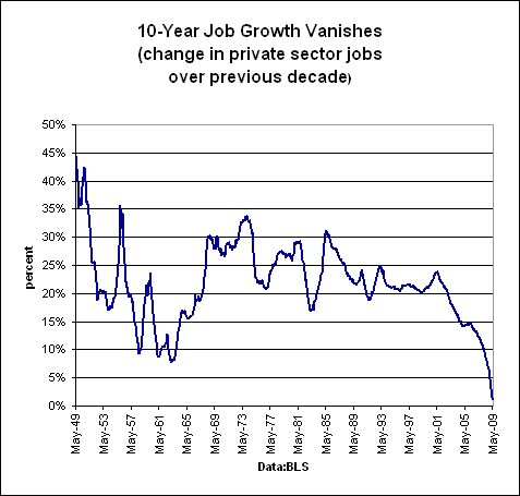
The first chart shows the historical growth in private sector jobs:

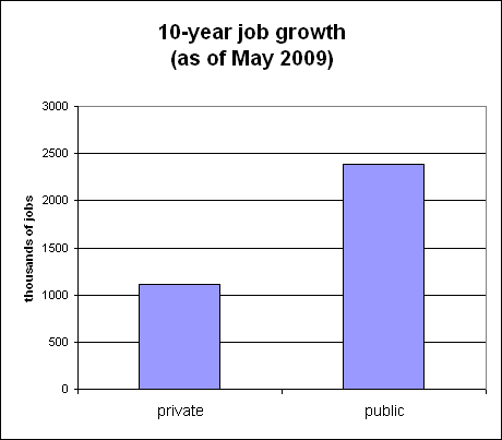
Now look at job growth in the private and public sector over the past 10 years.

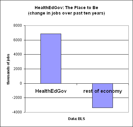
Mandel takes it one step further. He looks at private sector jobs that are heavily dependent upon government expenditures versus those that are not.

Essentially net job growth only occurred in health and education and government related jobs, all dependent upon heavy government subsidies.
What Mandel is describing in his charts is an economy in terminal decline.
- Bulenox: Get 45% to 91% OFF ... Use Discount Code: UNO
- Risk Our Money Not Yours | Get 50% to 90% OFF ... Use Discount Code: MMBVBKSM
Disclaimer: This page contains affiliate links. If you choose to make a purchase after clicking a link, we may receive a commission at no additional cost to you. Thank you for your support!


Leave a Reply