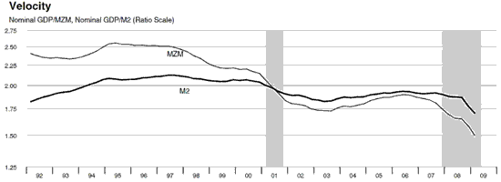
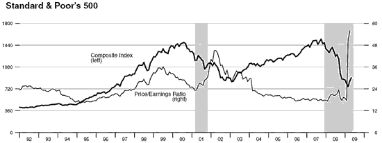
Someday this report will be, or should be, included in the history books. Two charts in particular are very pertinent to the here and now… The first being the Velocity chart:

This is exactly why the stimulus and money creation has no effect. Money that is created is needed and used to service or pay down the massive debts. MZM is the broadest measurement of money supply and a velocity of 1.5 is DEAD. This is exactly what you would expect to see in deflation and the current number coupled with the PPI and CPI data are beginning to look like we’ve entered a deflationary spiral.
The next chart of immediate importance is the chart showing the Price to Earning’s ratio of the S&P 500. The ratio is spiking because earnings are collapsing – COLLAPSING, as in HISTORIC. Market bottoms do NOT occur at P/E’s in the 50’s! They occur at P/E’s less than 10.

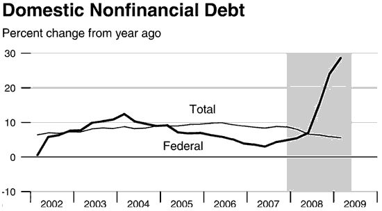
Below is the entire release. The charts regarding required reserves and reserves are pure FANTASY. The banks have no, as in ZERO, real reserves. What they have is borrowed money lent to them against worthless collateral. The rest of the report shows economic history being made:
Bonus chart:

- Bulenox: Get 45% to 91% OFF ... Use Discount Code: UNO
- Risk Our Money Not Yours | Get 50% to 90% OFF ... Use Discount Code: MMBVBKSM
Disclaimer: This page contains affiliate links. If you choose to make a purchase after clicking a link, we may receive a commission at no additional cost to you. Thank you for your support!


Leave a Reply