Simon’s weekend summary included this sentence on the macroeconomic situation: “The real economy begins to bottom out, although unemployment will not peak for a while and could stay high for several years.”
We are now in that phase of the crisis when there is a lot of arguing about whether things are going well or poorly, and that largely comes down to whether the current slowdown in the rate at which things are getting worse (that’s all it is so far) will be followed by a healthy recovery, a prolonged period of stagnation, or an accelerated contraction brought on by higher oil prices, a new bank panic caused by defaults in credit cards and commercial mortgage-backed securities, or one of any number of other factors. I discussed this topic somewhat impressionistically a month ago; this time I’m going to highlight some analyses done by other people around the Internet.
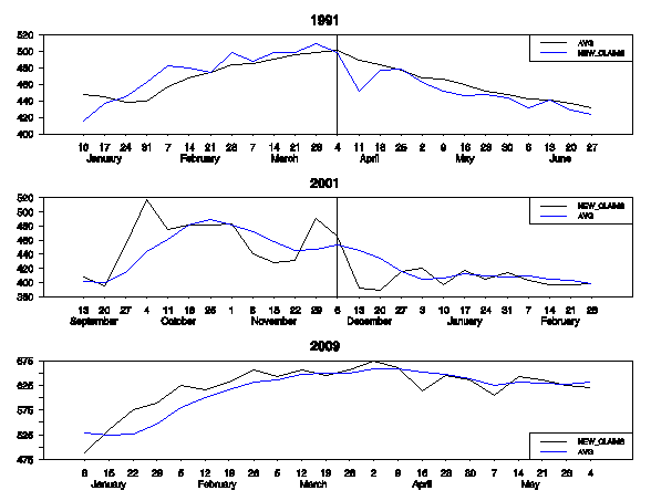
Last time I cited James Hamilton and Calculated Risk, both of whom thought that a peak in the four-week moving average of new unemployment claims was a good predictor of the end of a recession. Hamilton in particular has been following this closely, and while we may have passed the peak, the number isn’t falling like it should. Here’s Hamilton’s picture from last week’s post:

Look at the smooth line in each chart and note how it falls in 1991 and 2001 but doesn’t fall in 2009. The original post also has charts for the three previous recessions.
Paul Krugman looks at the same data and estimates that even though new claims are down from their recent peak, as long as the number remains above 400,000 aggregate employment is still going down, not up.
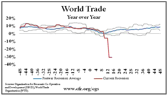
If charts are your thing, Paul Swartz of the Council on Foreign Relations has eight pages of them (hat tip Brad Setser), comparing the current recession to all postwar recessions (it’s the worst on most measures) or to all postwar recessions and the Great Depression. Here’s one striking example:

- Bulenox: Get 45% to 91% OFF ... Use Discount Code: UNO
- Risk Our Money Not Yours | Get 50% to 90% OFF ... Use Discount Code: MMBVBKSM
Disclaimer: This page contains affiliate links. If you choose to make a purchase after clicking a link, we may receive a commission at no additional cost to you. Thank you for your support!


Leave a Reply