I’m still looking for, and still not seeing, the economic recovery that everybody is talking about.
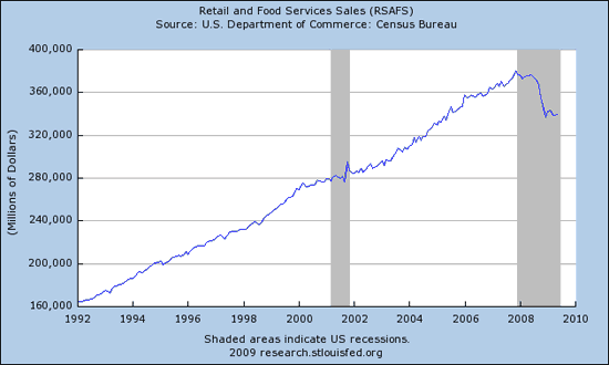
Source: FRED.
One bit of good news this week was the Census Bureau report that nominal seasonally adjusted U.S. retail and food services sales rose 0.5% in May. But of the $1.57 billion increase in total spending, almost $1 billion of it came from extra spending at gasoline stations. An optimist might read that as an indication that consumers are now prepared to spend more, and just happened to devote most of that extra spending to gas. A pessimist might worry that it portends further cuts in spending on other items ahead. But then, pessimists always find something to worry about, don’t they?
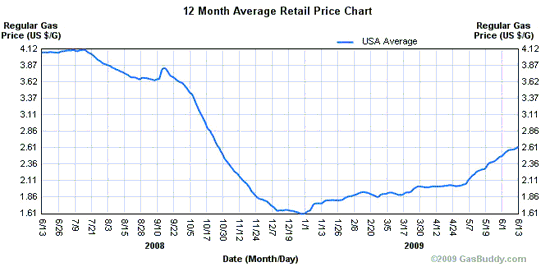
National average U.S. gasoline retail price. Source: NewJerseyGasPrices.com.
Or perhaps we can take some cheer from the Labor Department report that new claims for unemployment insurance fell again this week. In principle that could be quite a promising signal. But this week’s number puts the 4-week moving average barely below the value we saw May 7.
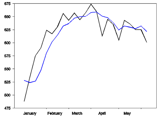
Seasonally adjusted weekly new claims for unemployment insurance (black line) and 4-week average (blue line) so far this year.
Count Jeff Frankel among the skeptics who see no hint of recovery in total hours worked.
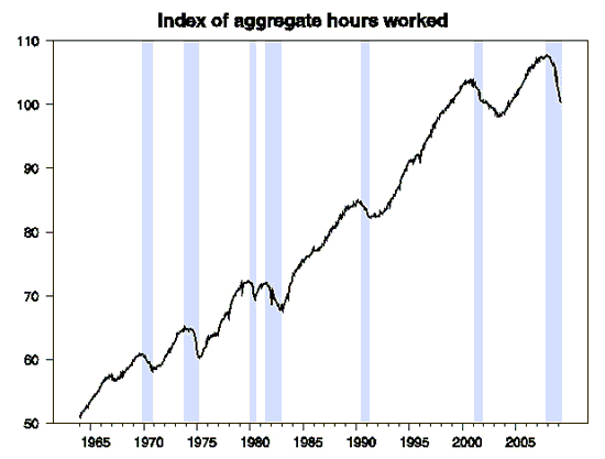
Seasonally adjusted index of aggregate weekly hours (CES0500000034), from BLS.
So maybe all the optimism is inspired by favorable developments elsewhere on this globe. Some point to a resumption of strong economic growth from China. But Edward Hugh (via Brad DeLong) notes that any growth in China is not coming from their ability to sell more products to the rest of us.
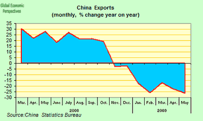
Source: Edward Hugh.
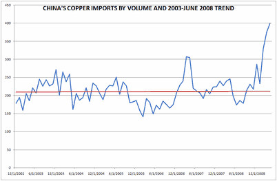
Is China’s domestic expansion so strong that it can carry this all by itself? Hugh steers us to Macro Man, who thinks that a big part of what’s happening is the Chinese are simply buying raw commodities to stockpile. Their copper imports, for example, far exceed what could plausibly be attributed to increased domestic production.
Source: Macro Man.
The above graph, by the way, appears to just go through April, and China’s copper imports were up another 6% from those sky-high April values in May. Macro Man has similar graphs for China’s imports of coal and iron, and a slightly less dramatic picture for oil. All of which may have something to do with the fact that, despite what looks to me to still be a very weak world economy, the average commodity price in the graph below has increased by over 25% in the last three months.
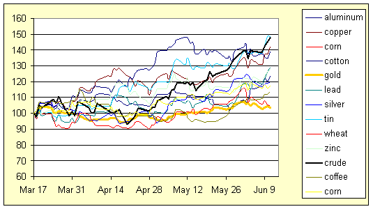
Prices of assorted commodities normalized at March 17, 2009 = 100. Data source: WSJ commodity cash prices, via Webstract.
- Bulenox: Get 45% to 91% OFF ... Use Discount Code: UNO
- Risk Our Money Not Yours | Get 50% to 90% OFF ... Use Discount Code: MMBVBKSM
Disclaimer: This page contains affiliate links. If you choose to make a purchase after clicking a link, we may receive a commission at no additional cost to you. Thank you for your support!



Leave a Reply