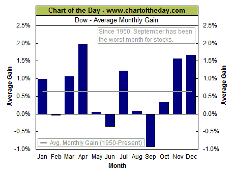
It is well known that September is the poorest month for sticks, worse than October. It gets less press because a lot of the well-known crashes occur in October (eg. 1987). The seasonal strong period kicks off in Nov, but at times starts in Oct, after one of those crashes; and hence Oct overall is slightly positive for stocks.
 I have been intrigued by continued comments in the STU that we are in a seasonal positive period. They are using it to help explain why their dreaded nested 1-2 setup is not acting like a coiled spring with a sharp drop down. The implication is when the momentary positive seasonality passes, the market drops.
I scanned for data, and it comes back predicting the first three days of this month will be positive. So far so good for Wed and Thurs; what about Friday? A summary of findings below the fold, including a look at the First Friday in September – tomorrow!
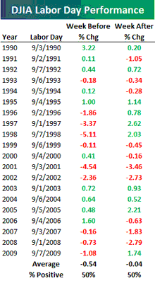
Bespoke on its blog put out an analysis going back 20 years of how the weeks before and after Labor Day perform. The overall conclusion is 50-50: half the time positive, and half negative, for both weeks. The average return is 0.5% negative for the week before, largely driven but some Septembers-to-remember (1997, 1998, 2001, 2002). This would seem to add to the Cruel September meme.
The first chart is monthly, the second is weekly. Can we do better and find a daily?
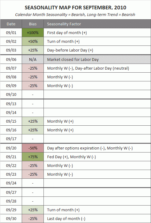
I first saw on SlopeofHope and tracked down another statistical map of September, this time with daily granularity, from MarketSci blog. Their seasonality map for September shows that the first three days of Sept (Wed Thur and Fri this week) historically should be positive, the first day of the month very positive. The week after sucks:
They then zero in on the day before vs the day after Labor Day:
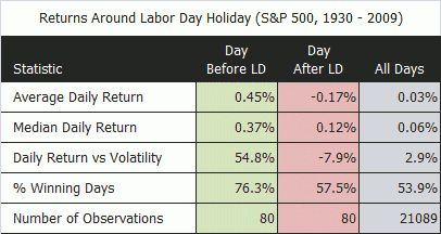
MarketSci take the data back to 1930, a broader look than Bespoke’s weekly data. Interesting is that they find that their day before/day after data is pretty consistent through 1993. From 1994 on, the day after does better than the day before. Here are their charts for waht would happen if you just traded on the day before vs the day after, and how the results flipped after 1993 (red line is the day after, green line the day before):
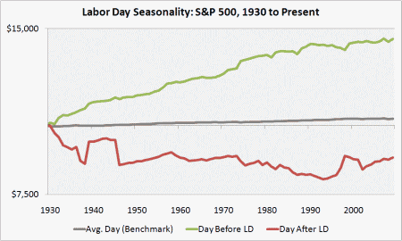
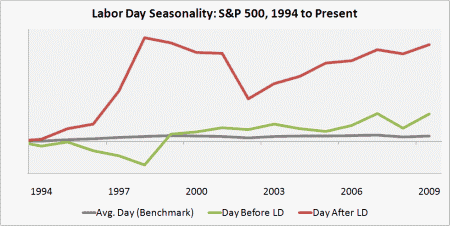
There is probably no good explanation for the flip in the pattern other than statistical relationships simply go away during a bubble, and we have had two bubbles in this period: the dot-com mania from 1995-2000, and the credit bubble from 2003-200.
Or, it shows that traders should not rely on stats!
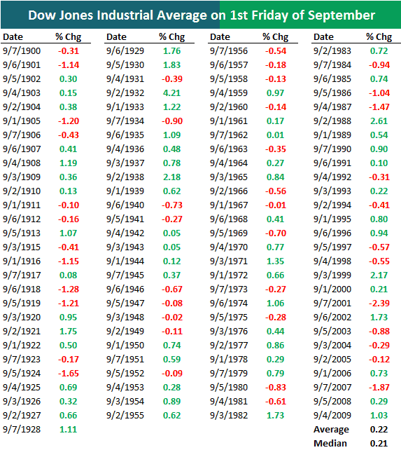
UPDATE: Bespoke has come back with more data, this time on the First Friday of September. They go back to 1900 this time, whereas their table above goes to 1990 and the MarketSci data goes back to 1930. The average change is +22bp, much higher than the average for all days of just +3bp. The median is also strong at +21bp. Even in the Lost Decade of the Oughts, the First Friday in Sept has been up 5 times and down 5 times.
Of course, the market was not as attentive to unemployment as they will be tomorrow.
- Bulenox: Get 45% to 91% OFF ... Use Discount Code: UNO
- Risk Our Money Not Yours | Get 50% to 90% OFF ... Use Discount Code: MMBVBKSM
Disclaimer: This page contains affiliate links. If you choose to make a purchase after clicking a link, we may receive a commission at no additional cost to you. Thank you for your support!


Leave a Reply