Nobody can tell you for sure what’s going to happen next in the stock market. But thanks to the nice data set collected and maintained by Yale Professor Robert Shiller we can speak with authority about what it’s been doing for the last 140 years.
Let me begin with an update of one of Professor Shiller’s graphs to which I’ve often referred. The green line is a price-earnings ratio on the S&P500 or earlier counterparts. So as not to overstate the impact of temporary spikes up or down in earnings, Shiller relates the current inflation-adjusted stock price to the previous ten-year-average of inflation-adjusted earnings. Despite the recent correction in stock prices, stocks still cost more today relative to the earnings you’re buying than they did over most of the previous century and a half. We’d still need about another 17% decline in stock prices to get back to the historical average valuation multiple.
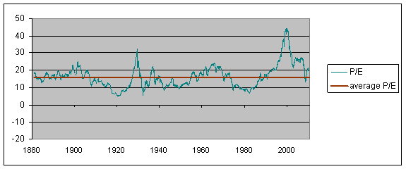
Figure 1. Green line: Ratio of real value (in 2010 dollars) of S&P composite index to the arithmetic average value of real earnings over the previous decade, January 1880 to Aug 2010. Red line: historical average (16). Data source: Robert Shiller.
One reason that might be worth paying attention to is the following graph, whose blue line shows the annual rate of return you would have earned by buying stocks at any indicated date and holding on to them for the next decade. The green line (the price-earnings multiple) you would know at the indicated date, whereas the blue line (the return on stocks over the next decade) you wouldn’t know until 10 years after the indicated date. What is pretty clear in hindsight is that those dates at which stocks were very richly valued turned out to be terrible times to buy. Anyone who was unfortunate enough to have decided to get into the stock market at the peak P/E in 2000 can testify that the most recent data have continued to confirm this century-long relationship.
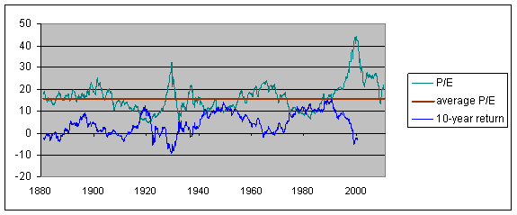
Figure 2. Green line: Ratio of real value (in 2010 dollars) of S&P composite index to the arithmetic average value of real earnings over the previous decade, January 1880 to Aug 2010. Red line: historical average (16). Blue line: average compounded nominal rate of return on stocks purchased at the indicated date and held for ten years from that date. Data source: Robert Shiller.
But shouldn’t we be comparing stocks not with a historical average, but instead with the currently very low yields available on alternatives like bonds? The next graph compares bond yields with stock yields, with the latter defined as the ratio of stock dividends to stock prices. Unlike the previous figure, this might appear to be a very unstable relation, with stock yields consistently above bond yields for the first half of the sample and consistently below for the next.
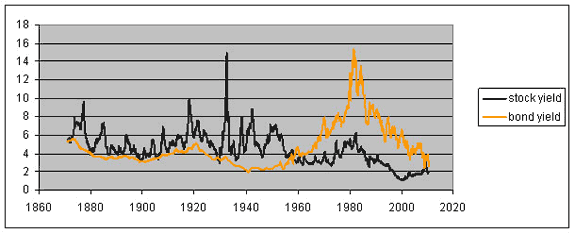
Figure 3. Black line: Ratio of nominal dividend paid on aggregate stock index two months earlier to current nominal stock price index. Orange line: yield on 10-year bond. Data source: Robert Shiller.
To understand what’s going on with that last relation, we also need to factor in inflation. Apart from an impressive spike in the price level in 1917-1919 associated with World War I, the first half of the sample was characterized by stable or falling consumer prices (deflation) and the second half by steadily rising consumer prices (inflation). Bond yields and stock yields pull apart when there is inflation because, unlike bonds, a stock is a real asset. With inflation, the dollar price of the company’s product should be going up, and with it the company’s nominal profits and dividends. To be sure, there can also be important relative price changes, so that some sectors will see their costs go up relative to product prices, while those selling them those inputs may experience the opposite. But certainly in an overall inflationary environment, we should expect to see the dividend yield well below the bond yield. In fact, the dividend was not far enough below nominal bond yields at the peak inflation of the late 1970s to be associated with a rational valuation of stocks. This may have been one factor in the below-average price-earnings multiples of that period (low green line in Figure 2 in late 1970s), and people who bought stocks at that time were richly rewarded (high blue line in late 1970s).
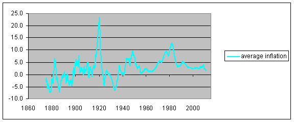
Figure 4. Average annual inflation rate for four years ending at the indicated date. Data source: Robert Shiller.
Even in an environment of stable consumer prices, we would still expect to see dividends grow as a result of growth of the real economy. But in the deflationary episodes of the earlier part of the sample, the stock dividend yield was usually well above the corresponding bond yield. Investors regarded stocks as sufficiently more risky relative to bonds that they sought compensation for taking that risk in the form of both a higher immediate yield as well as prospects for future dividend growth.
The next graph takes a more detailed look at the most recent behavior of stock and bond yields. Over this more recent period we can also compare the stock dividend yield directly with the yield on Treasury Inflation Protected Securities, which is more of an apples-to-apples comparison than Figure 3. A buyer of stocks today is usually getting a higher immediate yield than on TIPS, in addition to prospects of future dividend growth. Just as they did in the 19th century, stocks as priced today should give you a significantly better return than bonds.
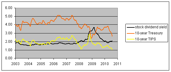
Figure 5. Black line: Ratio of nominal dividend paid on S&P500 two months earlier to current S&P500. Orange line: yield on nominal 10-year Treasury. Yellow line: yield on inflation-indexed 10-year Treasury. Data source: Robert Shiller and FRED.
But, now as then, stocks are also significantly more risky than bonds.
Long-term perspective on the stock market
- Bulenox: Get 45% to 91% OFF ... Use Discount Code: UNO
- Risk Our Money Not Yours | Get 50% to 90% OFF ... Use Discount Code: MMBVBKSM
Disclaimer: This page contains affiliate links. If you choose to make a purchase after clicking a link, we may receive a commission at no additional cost to you. Thank you for your support!


Work by asset allocation research shop, Wainwright Economics, challenges Robert Shiller’s assertion – on which so much rides.
The stock market may not be as expensive as Shiller’s P/E ratio suggests. According to the Financial Times, the US stock market’s P/E ratio, as modified by Robert Shiller, implies stocks are overvalued by some 20%. But based on an alternative formula for the ratio Wainwright uses, the market is barely above fair value.
Wainwright does not share Shiller’s belief that past earnings are a good benchmark for valuing the stock market, because earnings are a statement about the past, while prices reflect the market’s hopes and fears of future. However, to the extent that investors insist on using earnings to value the stock market, Wainwright agrees with Shiller that they should be cyclically adjusted.
In research published in July, Wainwright shows that the simple ratio of P to E is ambiguous and unreliable because it is strongly correlated with future earnings growth. If the ratio happens to be historically high, it can’t tell us whether it is P or E that is out of whack.
The market’s P/E should be modified in such a way that the interpretation is unambiguous. Ideally, a modified ratio should be a successful forecaster of price appreciation without being correlated with future earnings growth. Shiller’s ratio of P to ten-year earnings, on a deflated basis, does not meet this test.
Another drawback of the Shiller P/E ratio is its use of earnings results that are five or even ten years old. It’s just implausible to assume that the market takes as long as that to price them.
Luis de Agustin