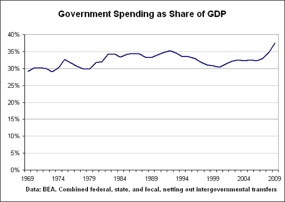
Given the political furor over budget deficits and the size of government, I thought it would be interesting to compare the patterns of government spending in 2007 (pre-financial-crisis) versus 1979 (pre-Reagan-Revolution). First, though, a long-term look at combined government spending at all levels (federal, state and local) as a share of GDP.

Remarkably, we see that government spending as a share of GDP moved within a relatively narrow band for a 30-year period. Government went from roughly 30% of the economy in the early 1970s, up to 35% of the economy in 1992, and then down to about 30% again in 2000.
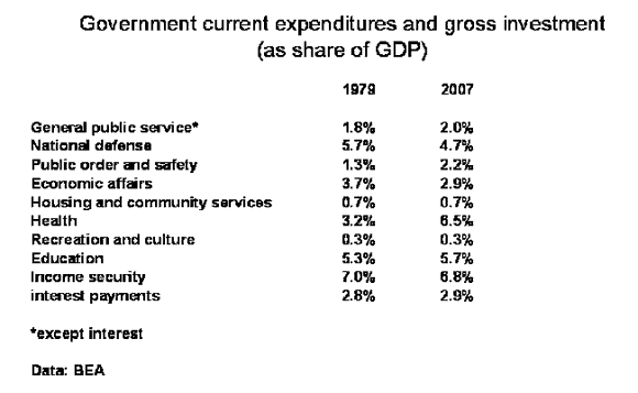
Now let’s look at government spending patterns. I’m going to compare 1979 and 2007, which were both business cycle peaks. I’m going to use the BEA’s data for government current expenditures plus gross investment (slightly different from the total expenditures charted above). Once again, this includes all levels…federal, state, and local.

Government spending patterns were little different in 2007 (pre-bust) compared to 1979 (pre-Reagan revolution). The biggest change was an increase in government spending on health as a share of GDP. Defense nudged down a bit, as did economic affairs (spending on highways, roads, R&D, etc). Spending on public order and safety nudged up. But overall, the patterns were remarkably similar
Of course, 2009 and 2010 (not yet available) would show big changes in the patterns of government spending. But given the long period of stability, we can regard those shifts as a response to the crisis rather than part of a long-term trend.
- Bulenox: Get 45% to 91% OFF ... Use Discount Code: UNO
- Risk Our Money Not Yours | Get 50% to 90% OFF ... Use Discount Code: MMBVBKSM
Disclaimer: This page contains affiliate links. If you choose to make a purchase after clicking a link, we may receive a commission at no additional cost to you. Thank you for your support!


Leave a Reply