Hard as it is to believe, the sense that the (financial) world is coming to an end is becoming almost commonplace. While such resignation is perhaps the stuff of which bottoms may eventually be born, Macro Man isn’t willing to countenance much more than a small short-covering bounce at this juncture.
As February comes to an end, more interesting to him is the comfortable fabric of the investment landscape may be fraying somewhat. It’s that time of year; Macro Man literally cannot remember the last March that did not bring (at least temporary) reversals and breakdowns of usual relationships. In his experience, January and February are for making money, and March is for playing defense. (Not that it should work that way, per se…it just seems to happen every year.)
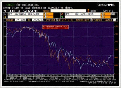
In that vein, it’s perhaps worth touching on a couple of points that suggest some fractures in the thematic monolith that is Financial Armageddon. Macro Man has already highlighted one issue in recent days, but it’s worth touching on again. Given that equities are near or at new lows, and that the economic newsflow remains execrable (Taiwan’s exports and IP both dropped more than 41% y/y in January!), one would normally expect USD/JPY to be on its knees. Yet here it is, up nearly 10% from last month’s lows, showing a clear correlation break with its supposed anchor, the SPX.
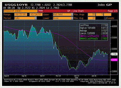
Similarly, one might rationally expect that an equity meltdown would prompt a safe haven bid for government bonds. Yet Treasuries have barely budged with the last 10% in the SPX, and have yet to put much, if any, dent in the step-jump rise in yields at the beginning of the year. While it’s true that German govvys have performed quite well, this probably has more to do with intra-European spreads than it does with outright longs.
Now, Macro Man isn’t sure what all of this means, other than that he has to be very, very wary of other correlation breakdowns, which could potentially submarine a previously smoothly-running portfolio mix. Correlation breakdowns are among the most difficult and frustrating things to trade from an established book of positions, so Macro Man is trying to keep an especially close eye on his assumptions…which will hopefully save him another frustrating March.
One notable development last night was JP Morgan slashing its dividend from 38c to 5c. Now, this would appear to be common sense, particularly for a bank, but it nevertheless highlights the frailty of one of the major arguments in favour of equities- namely, attractive dividend yields. A quick survey of his Bloomberg shows the SPX with a divvy yield of 3.8%; the FTSE has a yield of 6.4%; the Nikkei has a yield of 3.0%, and the Eurostoxx has a yield of 8.2%. Yowsah! Who needs bonds when you can buy equities and, if not wear diamonds, clip divvys?
JP Morgan highlights your answer. Dividends represent a claim on an earnings stream that a)
may be lower, or at least more uncertain, in the future, and b) need not be paid out to rhe same degree at all times. While it is true that earnings recessions generally see payout ratios rise, it is also a case that there is a limit to everything. Macro Man would humbly submit that an S&P 500 paying out 113% of earnings in dividends is ripe for the type of divvy cut that JPM delivered last night.
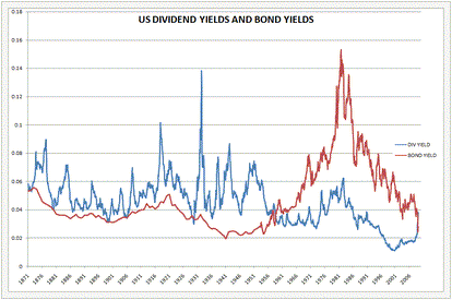
More broadly, there is no gurantee that dividends yields will fall. It could be the case that stock get “cheap” and stay “cheap” for a long, long time. Indeed, time was that divvy payments represented a substantial portion of an equity’s total return, and Macro Man has maintained for some time that there is a risk that we return to that regime. It is perhaps worth re-posting a chart that Macro Man showed last autumn; there is a long and glorious history in the US (which ended in roughly 1957) of dividend yields trading above government bond yields. This party could just be getting started.
This little wander down memory lane stoked Macro Man’s imagination. The first month of the Obama administration has come and gone, and the results from both a policy and market perpective have been underwhelming. (This is an observation, and is not intended to spur unrewarding political debate.) This got Macro Man thinking…..how does the equity market’s performance in the first month of this administration compare with that of previous Presidents? With the aid of Bob Shiller’s excellent online database, he took a look.
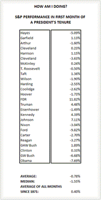
The chart below sets out the equity market price change during the first month of a President’s tenure. Grover Cleveland, with two separate terms, is counted twice. The short answer is that while equities have performed poorly during Obama’s first month, he has plenty of company; indeed, during Macro Man’s lifetime, only Bush I and Clinton have seen the stock market go up during their first month of office.
More broadly, since Rutherford B. Hayes, the first month of a president’s tenure has seen stocks go down. Some of this may reflect a “shock value” deriving from presidents who die in office, but that doesn’t appear to be the case; Truman and Johnson saw sparkling returns during their first months in the White House. A more cynical theory might be that when new presidents fail to walk on water, markets express their disappointment…and then recover as expectations are set to a more realstic level (and, one might add, a new president’s policy platform has time to gain traction.)
Macro Man leaves it to the reader to judge for himself which of these has been in play for the past forty years or so……
- Bulenox: Get 45% to 91% OFF ... Use Discount Code: UNO
- Risk Our Money Not Yours | Get 50% to 90% OFF ... Use Discount Code: MMBVBKSM
Disclaimer: This page contains affiliate links. If you choose to make a purchase after clicking a link, we may receive a commission at no additional cost to you. Thank you for your support!


Leave a Reply