McKinsey had a great chart today:
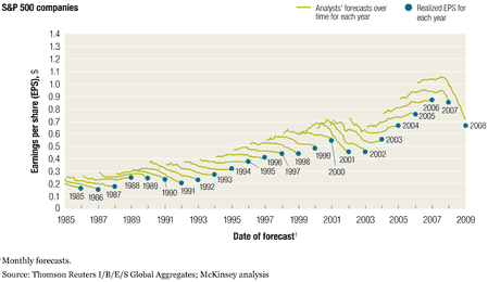
To explain the chart – the green are the predictions for the next year at various times in the past. The blue is the truth that eventually comes along. So, the predictions do tend towards the truth as time goes on.
They’re consistently optimistic – but does the data justify a more sophisticated model? Or is the design of markets inherently biased towards rewarding optimists more than realists?
- Bulenox: Get 45% to 91% OFF ... Use Discount Code: UNO
- Risk Our Money Not Yours | Get 50% to 90% OFF ... Use Discount Code: MMBVBKSM
Disclaimer: This page contains affiliate links. If you choose to make a purchase after clicking a link, we may receive a commission at no additional cost to you. Thank you for your support!

Leave a Reply