Calculated Risk directed us to a lesser know economic indicator, real personal income less transfer payments, a measure intended to strip out some of the impact of automatic stabilizers in the personal income data. I found it an interesting series to play with. Eyeballing the series, it looked like we were well below trend. How low? And how does the trend evolve over time?
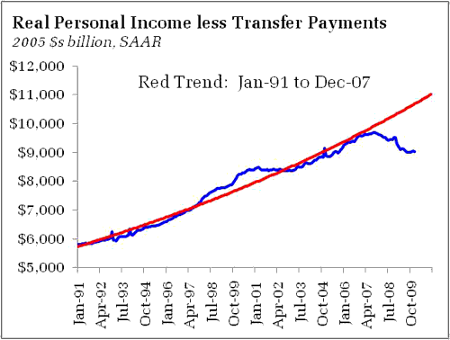
To recreate the series, I took the difference of nominal personal income and current transfer payments and deflated the resulting series by the personal consumption expenditures price index. I then estimated the (log) linear trend over various time horizons. We are currently well below the trend extrapolated the from Jan-91 to Dec-07 period:
An interest subset of this period is the trend during the tech boom, Jan-95 to Dec. 00. The rapid rate of income growth during that period, although likely not sustainable, felt good for a reason:
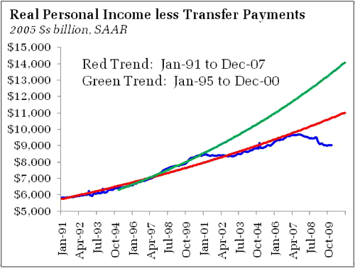
Too bad we could not maintain that trend. With income growth likely that, tax coffers would be overflowing. Remember how we used to think the next financial crisis would be too little Treasury debt? Good times.
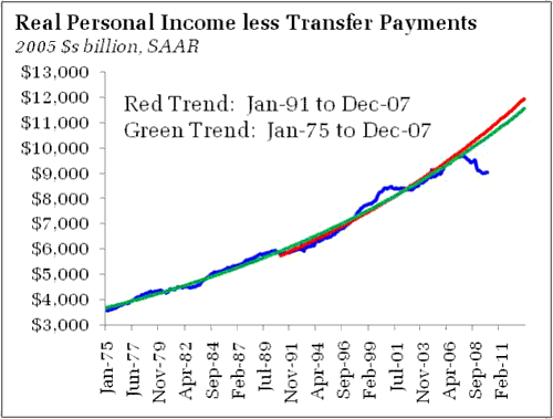
Using a longer sample to estimate the trend reveals that the Jan-91 to Dec-07 trend was set to trend just slightly above the longer Jan-75 to Dec-07 trend:
Importantly, the gap between trend and actual real personal income less transfer payments has reached its widest since 1975:
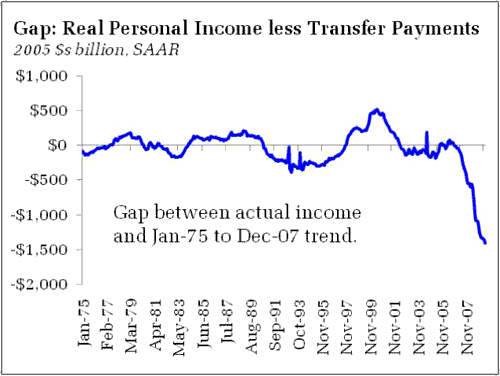
And we used to think the late 70s were bad! (The same qualitative result holds using the Jan-75 to Jan-10 sample).
Looking at per capita measures (linear trend) provides similar insights:
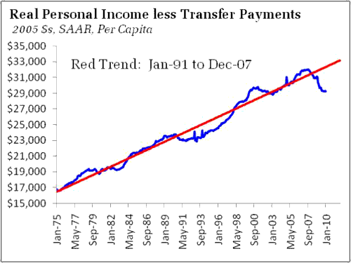
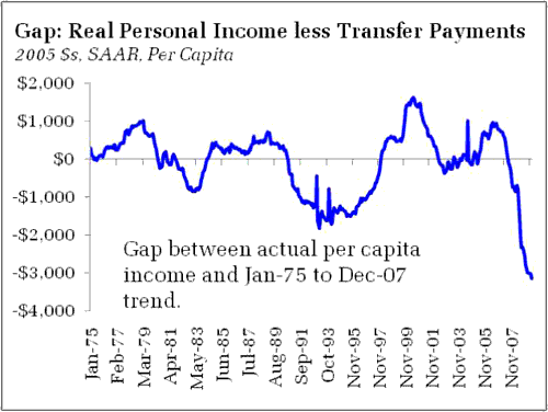
Yet another way of looking at the data that reminds us how much ground has been lost during the recession – despite growth, we still have a long road until we return to normalcy.
- Bulenox: Get 45% to 91% OFF ... Use Discount Code: UNO
- Risk Our Money Not Yours | Get 50% to 90% OFF ... Use Discount Code: MMBVBKSM
Disclaimer: This page contains affiliate links. If you choose to make a purchase after clicking a link, we may receive a commission at no additional cost to you. Thank you for your support!


Leave a Reply