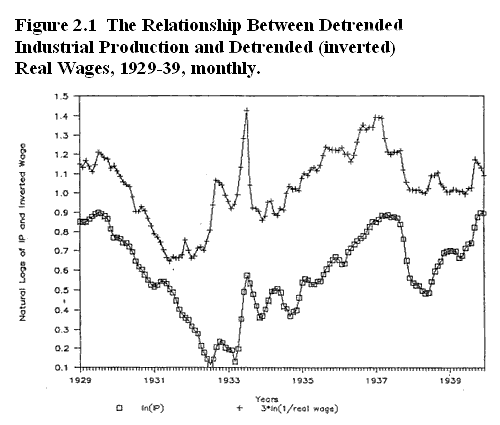
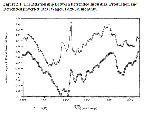
This is the graph that should have been posted with the “Payback” post last week. I’d like to thank Rob Fightmaster, who helped me get this and several other graphs into a form that could be posted. (If you can’t see it well, there is a bigger version at the very bottom.)

The bottom time series shows the Great Depression. More specifically, it shows the log of industrial production, monthly, detrended, from the beginning of 1929 to the end of 1939. And the Depression still wasn’t over. The two low points are July 1932 and March 1933 (the month FDR took office.) Then you see the 4 month spike in industrial production that I often discuss in my blog. That peaks in July 1933.
On the top is the real wage series; the nominal manufacturing wage deflated by WPI. Also logs, with the variation multiplied three times. Most importantly, the real wage series is INVERTED, to make it easier to see the negative correlation between W/P and IP at high frequencies, which is very much obscured using annual data. Just looking at 1933 makes it easy to see why. Real wages fell very sharply during that period of explosive growth between March and July 1933, and hit bottom in July. Then real wages soared and output plunged.
I don’t want to oversell this graph; I think other factors like Smoot-Hawley and the huge rise in MTRs during 1932 also help explain the extreme fall in output during 1932. Since I don’t plan to post my chapters covering 1933-40, perhaps I should say a word about the events that shaped the very uneven course of the recovery:
1. As you can see IP fell sharply after the July 1933 peak, in response to FDR’s surprise decision to raise all wages by 20%. Not surprisingly, there was a huge stock market crash as the story leaked out over three days (indeed the 3rd biggest three day crash ever.) By late October FDR was getting nervous. Time for another shot in the arm from more dollar depreciation. He brought in George Warren, who I discuss in this post. As far as I know every single economic historian, liberal and conservative, think Warren’s policy failed. Actually it succeeded. The dollar fell sharply between October 1933 and February 1934. Industrial production began rising and peaked in the spring of 1934.
2. Then FDR decided to raise wages again (I know, don’t they ever learn?) And again he killed off a promising recovery.
3. In May 1935 IP was still lower than July 1933. The Supreme Court then declared the NIRA unconstitutional. (The NIRA was the law that allowed FDR to raise wages.) The economy took off on a two year boom. It was helped by fast rising prices between mid-1936 and mid-1937. The prices rose because once the international gold standard fell apart in 1936, hoarders who had feared devaluation now dis-hoarded on the reality of devaluation. Output should have risen rapidly right up through the summer of 1937.
4. Actually, output hit a wall in early 1937. The Wagner Act was a response to the Supreme Court’s NIRA decision. It made it much easier to form unions. The union movement was emboldened by FDR’s big win in late 1936, which unions had helped to achieve, and union drives rapidly increased membership in late 1936 and 1937. The resulting wage shock slowed the economy sharply in 1937, despite high prices.
5. As the economy slowed, people began to no longer fear inflation, but rather deflation. Gold hoarding increased strongly in late 1937 in response to renewed fears of dollar devaluation, causing prices to fall. This created an identical situation to 1920-21 and 1929-30, as prices fell rapidly. Since wages are slow to adjust (particularly with the stronger unions) real wages rose and IP fell sharply.
6. Eventually wages did adjust, and in the spring of 1938 output began rising. Then in late November 1938, FDR instituted the first minimum wage law (25 cents an hour) and the recovery immediately stalled. In the spring of 1939, the economy again began recovering. But in November 1939 he raised the minimum wage to 30 cents an hour, and the recovery stalled for the 5th and last time.
7. Unfortunately my graph gives out at the end of 1939. In early 1940 the economy was weak, but it took off like a rocket after the German invasion of France, which is when the “phony war” turned into a real war. I don’t study this time period, but there were two factors contributing to recovery. Fiscal stimulus; and (perhaps) higher inflation expectations, both of which would reduce currency hoarding.
This has always been my favorite graph (or perhaps tied with that famous 6 dimension graph showing Napoleon in Russia.) I believe it provides the key to the Great Depression. If one can explain why real wages moved up and down, then you’ve explained the Great Depression. Not all of the Depression, as I indicated earlier other real shocks were important. But it explains the Great Contraction, and also why the recovery was so long and uneven.
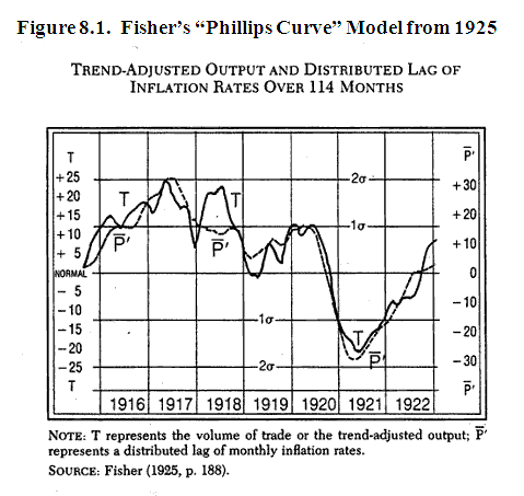
It may be interesting to compared this real wage model (if “model” is the right term) to Irving Fisher’s famous Phillips Curve model, published in 1923 and 1925. The first graph (at bottom of post) shows the 1921 depression, the one Austrians like to talk about. As you can see it was quite deep, and is almost perfectly explained by Fisher’s Phillips curve model (which explains output fluctuations with a distributed lag of inflation rates.) Indeed I imagine Fisher’s simple model would explain output during that period far better than modern new Keynesian Phillips Curve models could.
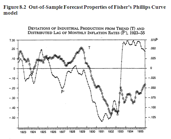
Ah, you ask, but how does it do “out of sample?” Anyone can fit a model to past data. I wondered the same thing, so I ran his model forward from 1923-35. As you can see, it didn’t explain things nearly as well. The correlation fell from .941 to .256. But take a closer look at the second graph. From 1923 to July 1933 the correlation is still a respectable .851. And it even predicts a “Great Depression” after 1929. Of course ‘predicts’ is misleading here, it is not an unconditional prediction. After all, Fisher is famous for having argued against the view that stocks were likely to crash. Instead, it makes a conditional prediction, based on price deflation that Fisher also didn’t anticipate.
One other thing; Fisher’s model says the economy should have recovered rapidly after March 1933. It did for 4 months, as dollar depreciation pushed prices much higher. What went wrong with his model after that? Phillips Curve models don’t take supply shocks into account. So it was unable to explain why the recovery was aborted in July 1933. That’s why I like my real wage “model” of the Depression better than the Phillips curve model. It explains much more. But Fisher made a good start, and the Phillips Curve obviously should be called the Fisher Curve.
The interwar economist whose views are closest to mine is Roger Hawtrey. His book The Gold Standard in Theory and Practice does a good job of presenting a “gold and wages” view of the Great Depression. David Glasner is also a fan. If you read it, make sure you do not get the first addition, from the early 1930s. Instead get a post-war edition from 1946 or 1947, so that you get his narrative on the entire Depression.


- Bulenox: Get 45% to 91% OFF ... Use Discount Code: UNO
- Risk Our Money Not Yours | Get 50% to 90% OFF ... Use Discount Code: MMBVBKSM
Disclaimer: This page contains affiliate links. If you choose to make a purchase after clicking a link, we may receive a commission at no additional cost to you. Thank you for your support!


Leave a Reply