With most of the big banks having reported 3Q earnings I wanted to take a look at how we’re progressing with loss reserves. Unfortunately, I did not find good news.
Here’s what I did. I took a look at Wells Fargo, J.P. Morgan and Bank of America. All three reported a decent breakdown of their loan exposures by type. (Click on each name above for their earnings presentation). I then took the loan loss estimates used by the Fed in the stress test and multiplied each bank’s exposures by the loss estimates. Note that the Fed basically had four loss estimates. They had a “Baseline” and a “Adverse” scenario, then they had a high and a low estimate within each of those.
Then I compared that loss estimate with the combined loan loss reserve and current write-downs the bank has taken. This analysis is far from perfect. Each bank reports things a little differently, so I had to make some judgments. Plus who really knows whether the Fed’s SCAP estimates for loan losses are right. Still, the Fed’s guess is as good as any, and the exercise should be illustrative of how close we are to the end of loan loss provisioning.
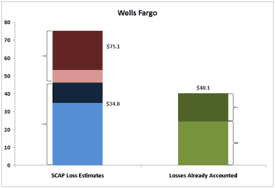
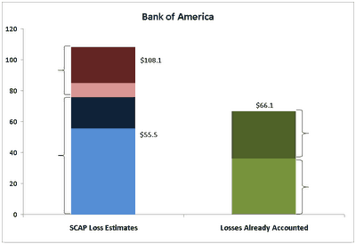
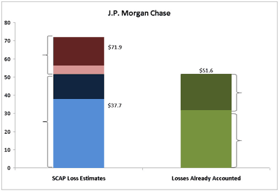
Alright, so on the left is estimated losses in all four scenarios, the bottom two blue bars being the “Baseline” and the top two being the “Adverse.” Then on the right is losses realized/provisioned to date.
First, Wells Fargo (WFC)

Ugh. Almost enough to cover the range of “Baseline” losses, but we should keep in mind, the baseline assumed unemployment would average 8.8% in 2010. Its currently 9.8%. The adverse assumed 2010 unemployment of 10.3%. Given that unemployment is almost assured to go higher before it falls, I’d be shocked if the number weren’t closer to 10.3% than 8.8%. Not that loan losses couldn’t possibly outperform the unemployment rate if you will, but I’d consider the red area more likely than the blue area.
Moving on to Bank of America (BAC)

About the same, although the mix of loans makes the distribution of blue and red a little different. Regardless, a long way to go here.
Now JPMorgan Chase (JPM)

A little better. Jamie Dimon has more than the Baseline SCAP loss estimate covered. Still, you’d think there are more losses coming here.
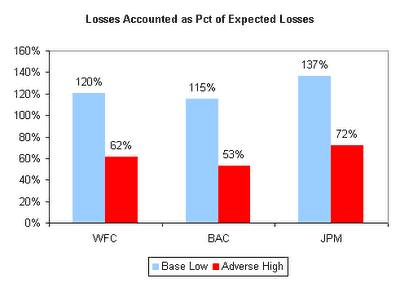
So comparing the three, I ran the losses already accounted as a percentage of the Baseline Low and Adverse High (in other words, the lowest and highest loss estimates in the SCAP) for each bank. Below is that chart.

Ugh again. At least with J.P. Morgan I can squint my eyes real hard and suppose that they might be getting close, especially given J.P.’s relatively small commercial loan book. But looking at Wells Fargo and Bank of America, these are still banks that are going to struggle to keep up with losses as far as I can see.
Now consider this. Bank of America 2014 bonds are +210, Wells Fargo +150, J.P. Morgan +140. Shouldn’t Wells and BofA be a lot closer? Shouldn’t there be a bigger gap between Wells and JPM?
- Bulenox: Get 45% to 91% OFF ... Use Discount Code: UNO
- Risk Our Money Not Yours | Get 50% to 90% OFF ... Use Discount Code: MMBVBKSM
Disclaimer: This page contains affiliate links. If you choose to make a purchase after clicking a link, we may receive a commission at no additional cost to you. Thank you for your support!


Leave a Reply