I’ve decided to start a new regular segment on Accrued Interest doing technical analysis of the 10-year Treasury. I’m planning on doing this about weekly, although I won’t swear it will always be on the same day.
This will be something of a departure for this blog, since classically I’ve rarely talked about trades I’m actually doing and even more rarely talked about short term trades I’m actually doing. But here is why I’m doing it. I think that going forward, there will be more money to be made trading bonds with a short-term view. I believe volatility will be permanently higher than in the recent past, and the ability to discern short-term movements will be the key to making money. I’d like to think opening up a discussion will help readers make more profitable trades.
The other reason is purely selfish. It is my long-term goal to start my own hedge fund. It wouldn’t really be for the money, more because I think that’s how I’m wired. If I could be running my own hedge fund but my income was only 75% of what it is now, I’d make that trade in a second. Anyway, although this eventual move may be a few years away, I’ve already built many of the models I plan to use as part of my trading strategy. Treasury technicals isn’t a model per se but it would be part of my trading strategy. The models are proprietary, but technicals aren’t. And besides, by sharing my strategies, I hope to get feedback from readers to perhaps improve my results.
So let’s get to it. You may remember last week I showed a chart suggesting that yields on 10s ought to fall. Didn’t happen, so let’s review what actually did. Below is a similar chart to the one from last week updated to now.
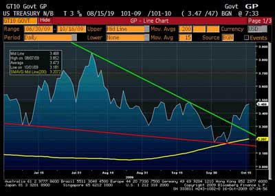
Note this is a yield chart, so downward moves are bullish. The yellow line is a 200D SMA, the red and green were trend lines I drew. At the time, the red and green seemed to suggest to me a pattern of lower lows and higher highs. But now it looks like a wedge. It bounced off the SMA, broke above the trend line and would seem to be headed higher in yield, lower in price.
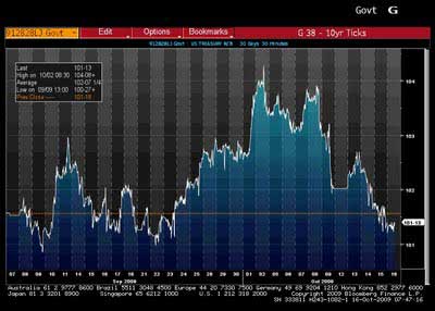
The above is a 30D intra-day price chart for the current 10-year. You can see the gap downward on 10/9, 10/12 was a holiday, 10/13 we filled most of the gap, and then started moving lower again.
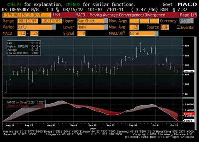
Looking at a plan vanilla MACD chart, short-term momentum is clearly bearish.
So the trade looks like a short. What’s the entry? Seems like there is resistance at 3.48%. This bar chart (with Fibs) shows there has been a lot of work done right around the current price level (this is a price chart, I know, price/yield gets confusing. You’ll get used to it.) I’ve circled the price area of approximately 101-3 to 101-16, where we see lots of action in early-mid September. That corresponds to about a 3.45-3.48% yield. Right where we are now.
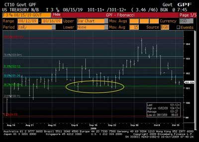
Note that bond guys didn’t seem to give a shit about the 50% re-trace from the highs. I know a lot of bond guys follow Fibonacci re-traces, but I honestly haven’t been able to make it work for me all too often. Don’t be fooled by the fact that 3.48% is very near the 38.2% line, because when all those trades were happening, it wasn’t the 38.2% line! Only once we hit the high on 10/2 did that become the number.
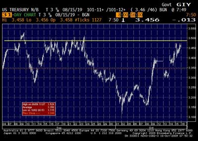
3.48% is backed up by this intra-day yield chart. The yellow line is 3.48%.
(click to enlarge)
After doing all this, my play is to leg into a short in three parts. First I’ve put on some right now. Second I may get the chance to put on more at about 101-24, or 3.41%,. Again, looking at the intra-day, that looks like an area of high-volume that we could revisit on a bounce off the 3.48% resistance. Then I’d add a third chunk once we breach that resistance in a meaningful way, maybe 3.50%.
- Bulenox: Get 45% to 91% OFF ... Use Discount Code: UNO
- Risk Our Money Not Yours | Get 50% to 90% OFF ... Use Discount Code: MMBVBKSM
Disclaimer: This page contains affiliate links. If you choose to make a purchase after clicking a link, we may receive a commission at no additional cost to you. Thank you for your support!


Leave a Reply