In the aftermath of yesterday’s two main votes in the U.S. Senate Finance Committee against including various types of public opinion in the reform bill working its way through Congress, the Washington Post today went back and conducted new analyses on its own poll (with ABC News) that initially gathered data from September 10-12.
Of the Finance Committee’s 23 members, 13 voted against both public-option amendments, eight voted for both amendments, and two split their votes (against one amendment and for the other). In their new analyses, the Post focused on the states represented by the first two groups of senators.
As part of a national survey, the pollster may ask respondents what state they live in (which the Post/ABC apparently did). With total sample sizes typically around 1,000 (it was 1,007 for the September ABC/Post poll), the number of respondents in any one particular state would almost certainly be too small for statistical analysis.
However, in a burst of creative thinking, the Post realized that aggregating the residents of states represented by the 13 strong-opposition senators, and doing the same with residents of states represented by the eight strong-proponent senators, could yield two fairly sizable subgroups in the data (although these exact subsample sizes did not appear to be reported).
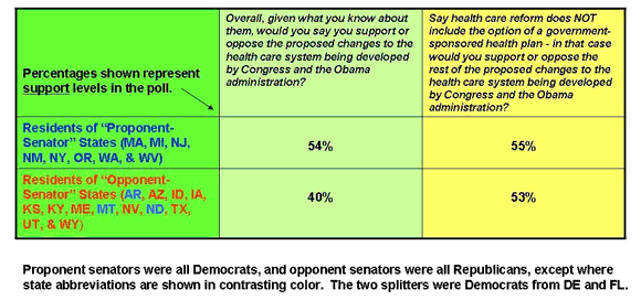
I have created the following table to summarize how the residents of the two sets of states (those represented by opponent and proponent senators) came down on two key questions discussed by the Post.

The Post’s conclusion, which I think is consistent with the support percentages shown in the table, is as follows (extraneous symbols edited out):
Among those living in states represented by the 13 Senate Finance Committee members opposing both amendments, a majority… gave a thumbs down to the health reform proposals being developed by the Congress and Obama administration. But when asked about a package that excluded a public option, the results flipped and most stood in favor of the reform effort.
The opposite was true among those living in states represented by the 8 members of the committee who voted for both amendments, as support in those states held steady regardless of the inclusion of a public option.
The Post’s re-analysis speaks both to the idea of (“small d”) democratic representation and the seeming power of the public option’s inclusion or exclusion in a final bill to turn around opinion in the “opponent-senator” states. As much as I admire the creativity of the approach, however, I feel it has at least one potential flaw.
While it may be true that in the aggregate the residents of the 13 “opponent-senator” states are negatively inclined toward a public option (although this is an inference from the rise in support for a hypothetical bill with the public option removed), it does not follow that each and every opponent-senator state opposes a public option. (I’m not saying that the Post asserted the latter, just that some readers could draw that conclusion on their own.)
In fact, as I summarize here, when many of the opponent-senator states are looked at individually, their residents actually support the public option by majority or plurality.
- Bulenox: Get 45% to 91% OFF ... Use Discount Code: UNO
- Risk Our Money Not Yours | Get 50% to 90% OFF ... Use Discount Code: MMBVBKSM
Disclaimer: This page contains affiliate links. If you choose to make a purchase after clicking a link, we may receive a commission at no additional cost to you. Thank you for your support!


Leave a Reply