A lot of charts have been updated this week, but I just want to point out a few in particular as the rest have not really changed that much since I last presented them.
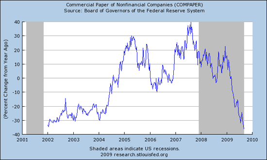
Regarding credit and money, keep in mind that CREDIT far exceeds MONEY. Here’s what’s happening to the yoy percent change in nonfinancial commercial paper:
Here is what’s happening to the monetary base:
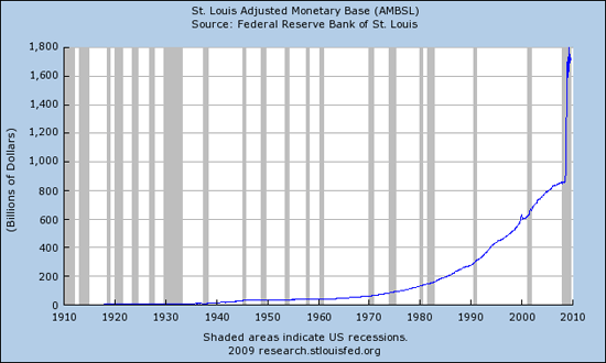
Which one is winning, and what does winning look like (keep in mind that’s only one type of credit)? Remember, we can’t directly see the effects on the Shadow banking world of derivatives and leverage.
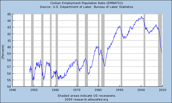
Regarding employment, below is a chart of the Civilian Employment–Population Ratio:
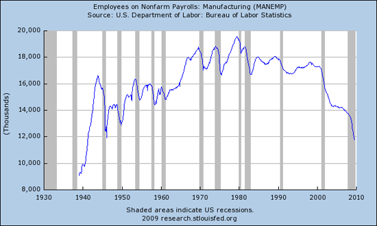
Below is the raw number of employees engaged in manufacturing. The number of employees in manufacturing has not been this low since 1942:
Below is a chart of those unemployed for 27 weeks or longer:
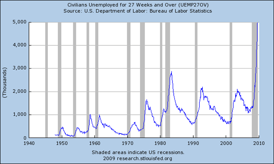
Below is the chart of those unemployed for only 5 weeks or longer:
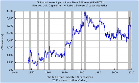
While the numbers on the short term chart are dropping from the peak, they are still at a very high range historically and short term chars are much noisier than longer term ones.
While the jobs are obviously no longer in the manufacturing sector, most of the other sectors are back to employment levels of the late 1990s. I am left wondering what happens when the monetary stimulus is pulled? Where are the jobs in America going to come from? “DING…”
- Bulenox: Get 45% to 91% OFF ... Use Discount Code: UNO
- Risk Our Money Not Yours | Get 50% to 90% OFF ... Use Discount Code: MMBVBKSM
Disclaimer: This page contains affiliate links. If you choose to make a purchase after clicking a link, we may receive a commission at no additional cost to you. Thank you for your support!


Leave a Reply