The Bureau of Labor Statistics [BLS] this morning released data for the Producer Price Index (PPI). The PPI indicates (or is supposed to indicate) what is occurring on the wholesale level. The Consumer Price Index (down 2.1% yoy) reflects (or is supposed to reflect) what is occurring on the Consumer level. Wholesale prices translate into consumer prices and thus the PPI tends to lead the CPI slightly.
The verdict? The BLS announced the following, “From July 2008 to July 2009, prices for finished goods fell 6.8 percent, the index for intermediate goods decreased 15.1 percent, and crude goods prices dropped 44.8 percent, all of which are record 12-month declines.”
RECORD DECLINES! Finished goods down 6.8% in one year!
While it’s true that if you strip out crude energy costs that the PPI was slightly positive, I believe it is delusional to do so. Energy underpins the cost of everything, from the manufacturing process all the way through to delivery. It is a huge component of the economy and needs to be fully considered. We now have a collapse in the Baltic Dry index, we have a collapse in truck and rail traffic, and we have a collapse in container and port traffic. Thus, the demand for oil is down, inventories are at historic highs and it is appropriate that the price of oil and related products are down.
Here’s the full BLS release of PPI data:
—–
Here is the chart of PPI for all finished goods expressed in year over year (yoy) percentage change. Why year over year data? Because month over month swings are noisy, they do not reflect the longer term trend and should, in my opinion, be mostly ignored:
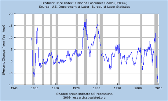
People who believe that we are experiencing inflation need to look at that chart REAL HARD. It is HISTORIC, as in NEVER in modern recorded history has the PPI fallen at this rate, never.
This past weekend I presented The Week in Charts – Buckle the Heck Up! Today a slug of confirmatory charts were released, confirming that, in my opinion, we are entering a deflationary spiral. This is roughly the same point in time that the same thing occurred in 1930 following the crash of 1929 and then 50% rebound in the markets. Now, like then, prices began to collapse and the equity market followed by grinding lower over the next year and a half before finally reaching the real market bottom. That leg down was FAR more painful to the people than the prior crash in equities – that’s the period that’s “depression.”
Now I’m going to show you a series of charts from the St. Louis Fed that were all updated and released as of today. When I say buckle up, impact is imminent, I mean it. Never before have you ever seen a collection of charts like this – they are truly historic.
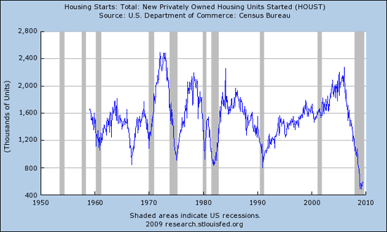
Of course we know that housing starts collapsed, but many mistakenly believe they have recovered. They have not and they were down further with this morning’s release. We still have far too many homes and we will have for quite some time to come. This chart shows clearly that support over the past 50 years was in the 800,000 unit level, we are still way beneath that:
DEBT has saturated everyone and everything at all levels. Deflation occurs when the total supply of REAL AND CREDIT dollars contracts. For inflation to be sustainable, INCOMES MUST INCREASE TO SERVICE HIGHER CREDIT (DEBT) LEVELS. You are going to find in the following charts that EXPENSES, particularly in government, are rising while INCOME at all levels is FALLING. For those following along (are you with me so far?), dollars created in the United States do not have to say here. It is an OPEN SYSTEM, capital is still free to leave (as seen in the past 3 months of net negative TIC flows). Also, DEBT drives the velocity of money down as I showed this past weekend. Base money velocity has collapsed, falling 75% year over year.
Those who can use a review of exponential math and parabolic curves, I invite you to please Spend some Time with the Good Dr. Bartlett. You see, growth begins slowly and controlled, but then enters a steeper growth phase where the compounding math begins to take hold, and finally a parabolic growth phase tops it off, leading to collapse as all parabolic growth eventually does.
The one and only TRUE leading indicator in an economy saturated with debt is the relationship of debt to income. Let’s look at our Government first…
GOVERNMENT
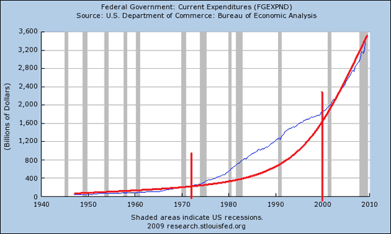
The following is a chart of Current Government Expenditures. A classic parabolic growth curve, this is destined to collapse but is still rising exponentially. I have highlighted this classic curve in red and segregated it into it’s three growth phases. Note that the more rapid middle phase began right at the same time that then President Nixon removed us from the gold standard entirely – 1971. The parabolic blow off phase began just as the NASDAQ began to top and crash:
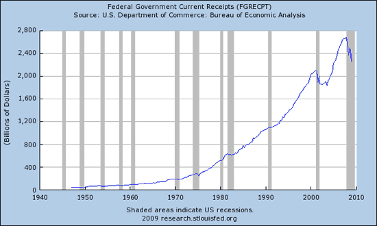
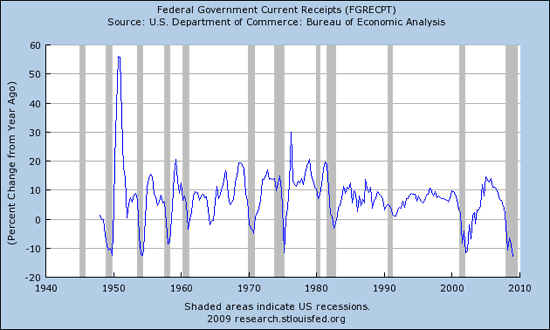
While expenditures are skyrocketing in an exponential growth phase, you can see that Federal Government Current Receipts also grew in an exponential manner but have now rolled over and are quite negative year over year. Thus we have ramping expenses and plummeting income:
Next is the same data presented in yoy percent change. The rate of fall in income has not been this great since the early 1950s:
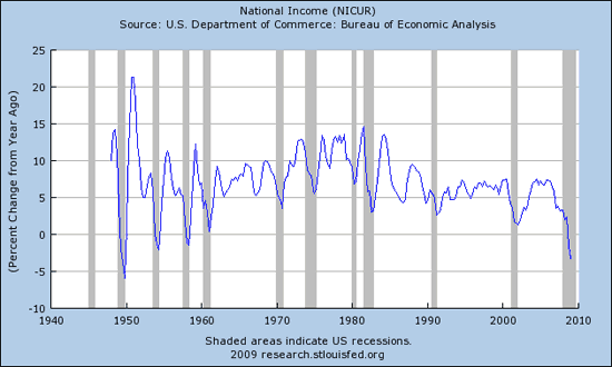
Another way to view our nation’s income is, believe it or not, called the National Income. Here is the chart of National Income, negative for the first time since the 1950s:
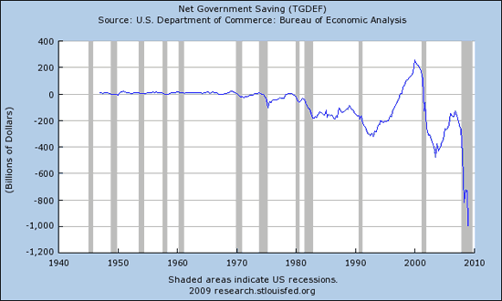
Of course when one takes IN more than goes OUT, we can call that SAVINGS. Or in the case of our Federal government, we call that a trillion dollar plus hole in the wall/national embarrassment:
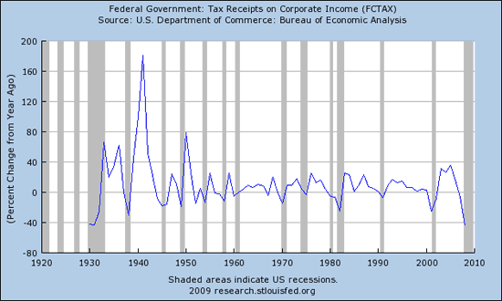
Here’s where a large chunk of the hole in income is located, Federal Tax Receipts on Corporate Income. At no time since 1930 has the collapse been this great, a 40+% year over year collapse:
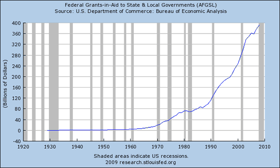
A sane and rational person cuts their expenses when their income falls. Not our politicians, no, no. Please admire the shear beauty of parabolic expenditures at work in this chart showing Federal Grants to State and Local Governments:
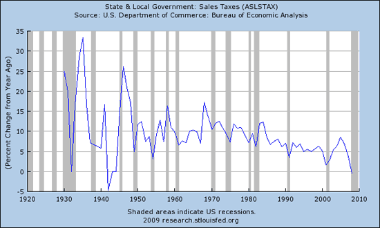
Now let’s examine how the states get their money (besides as grants from the Federal Government) – State and local sales taxes are a large part of it. NEGATIVE for the first time since the early 1940s:
CORPORATIONS
We know that corporate tax receipts are cliff diving, that is primarily because corporate profits are cliff diving. Anyone in the stock market remember that? Apparently not…
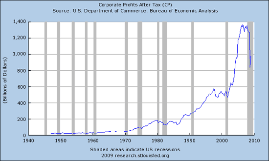
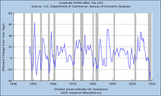
Here’s an updated look at Corporate Profits after tax. Another classic parabolic curve that has topped and is now collapsing. A small bounce, yes, but I will contend that the blip you see upwards is due primarily to FASB’s change in allowing the financial industry to resume marking their toxic portfolios to their own models. Without that, I believe overall corporate profits would be much smaller, but is still historic as it stands:
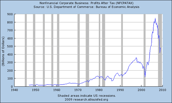
Here’s the chart showing Corporate Profits after tax for NONFINANCIAL companies… The drop is more severe, you can thank your paid for Congressman for allowing/pressuring FASB to continue accounting rules that make former Enron executives blush by comparison:
Here are Corporate Profits After Tax expressed in yoy percent change. You will see that the most recent collapse is the largest in history and is still down more than 25% yoy, and one year ago they were way down from the year before that. Is that a bottom bounce? Want to bet your hard earned dollars on it?
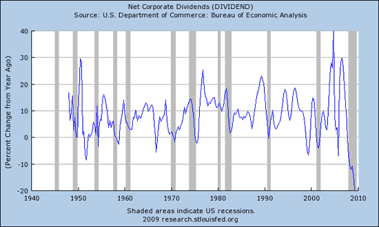
That’s the picture for corporate profits, how about corporate dividends? Can you say, “HISTORIC COLLAPSE?” I thought you could:
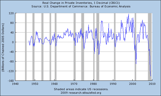
When the Fed speaks of “private” what they mean are “nongovernmental.” Speaking of historic collapses, here’s a chart showing Real Change in Private Inventories expressed, as the Fed presents it, in billions of dollars (chart not available in yoy percent change):
INDIVIDUALS
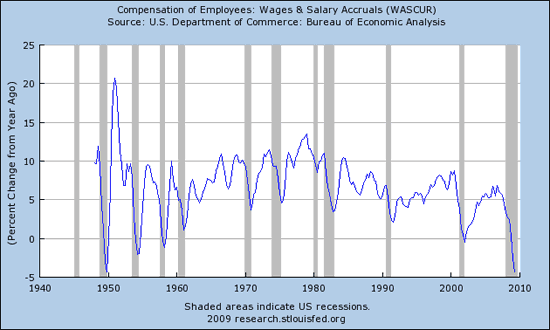
Of course it is private business that provides jobs to individuals. That’s how they earn their income. No income, no spending. No spending, no corporate profits, and certainly no inflation.
Here’s a chart showing Compensation of Employees… at no time since 1949 has it been more negative on a yoy percent change basis:
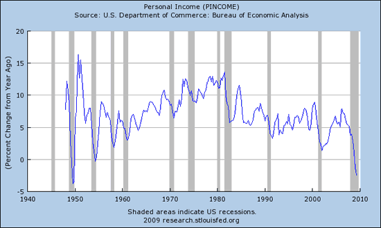
Here’s another way of looking at the same thing, Personal Income:
And yet another metric for income is the Disposable Personal Income, negative for the first time since the late 1940s:

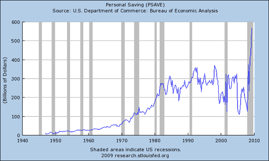
Despite overall falling income, we all know that the personal savings rate has done a 180 degree turn and is now climbing rapidly. It continues to climb sharply expressed in billions of dollars:
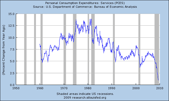
With both incomes plunging and savings soaring, that leaves less for Personal Consumption, right? Below is a chart of Personal Consumption of Services. Note the structural downtrend that has occurred since 1980 (same year interest rates peaked) when expressed in yoy % change:
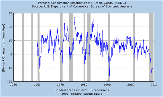
Next is Personal Consumption Expenditures for Durable Goods:
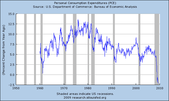
And here is the Total Personal Consumption Expenditures, NEGATIVE for the first time in modern history:
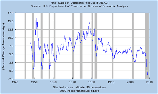
This must mean that sales are in the gutter, right? Well, take a look at the chart showing Final Sale of Domestic Products… other wise stated, sales of domestic products. NEGATIVE for the first time in modern history. Think there’s something going on there?
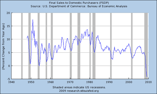
And that’s different than Final Sales to Domestic Purchasers, that’s looking at just people who buy things from within the United States. Again, NEGATIVE for the first time in modern history:
Anyone seeing a trend here? Incomes down across the board, government spending insanely up, but overall Producer Prices making a historic plunge.
Tax revenues are destined to fall appreciably more in my opinion, and that will make the already historic deficits that much worse.
Once again I do not see any inflation as I look through the charts. I see deflation and I believe that the total amount of credit is in contraction despite the sky high money aggregates and Federal money pumping. The Shadow banking system is FAR, FAR bigger than the Federal government, and while it was a miracle at pulling future income forward in time, overall income is falling and simply cannot service even more debt.
Keep looking for inflation, eventually you’ll find it, but not before the debt is cleared from the system in earnest.
Disclaimer: This page contains affiliate links. If you choose to make a purchase after clicking a link, we may receive a commission at no additional cost to you. Thank you for your support!


One thing you overlook, and you would see it if you synthesized some of your charts and added some more (anecdotal?) data. Really you should have a chart for it. I am referring to the collapse of the supply chain. I think your thinking is still a bit too supply side. You know, if there were only more demand, things would be hopping. But as the economy deteriorates, the supply chain collapse leaps out from the shadows to keep the economy from getting on its feet again.
Very few people follow the supply chain, but it was really the thing that got Roosevelt to do even the modest amount he did to preserve important facts in the society such as housing and education.
The U.S. supply chain is disintegrating. When the documents finally come out from the most knowledgeable members of the government, you will see that this is what spelled doom to them.