Here’s a map showing the average unemployment rate over the last year by U.S. county. Things are back to normal along a swath through the middle of the country, but still fairly bleak elsewhere, particularly for example here in California.
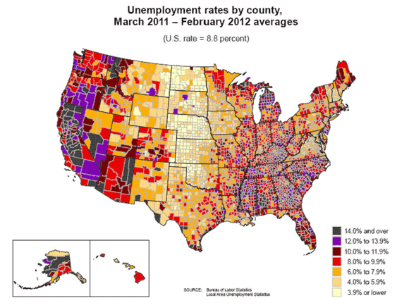
Source: BLS
Calculated Risk also prepared this interesting graphic comparing current unemployment rates by state (in red) with the maximum achieved during the recession (in blue). Karl Smith comments on some related graphs.
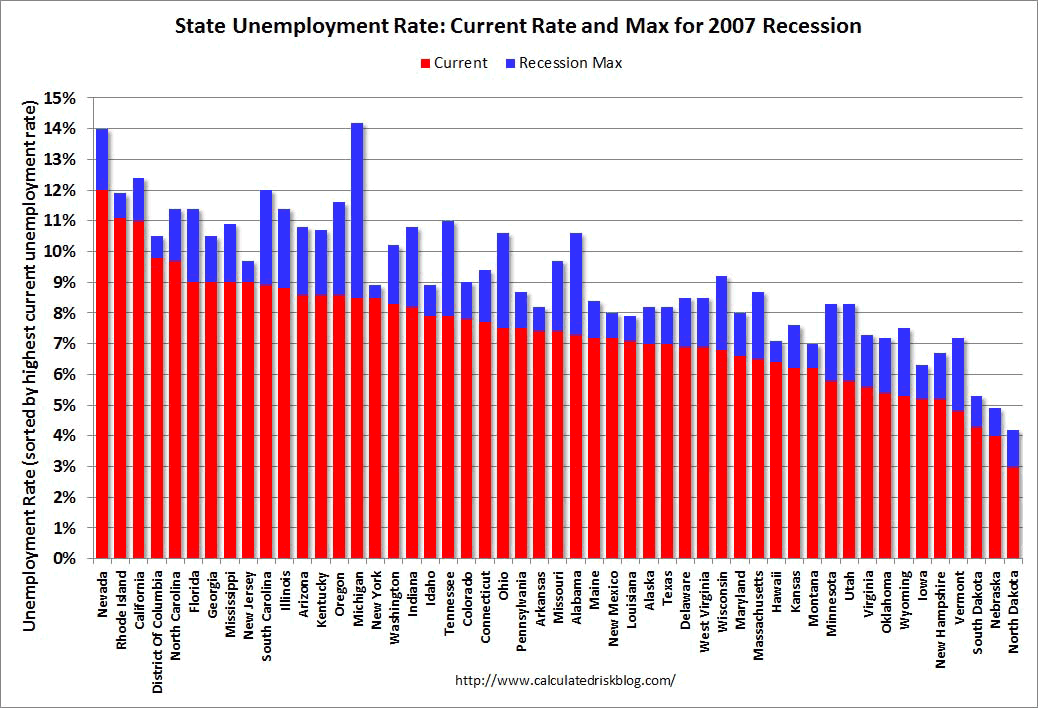
(click to enlarge)
The states which had experienced the biggest run-up in real-estate prices between 2000 and 2005– California, Rhode Island, Nevada, and Florida– were among those hit hardest by the recession and today are the places having the most difficult time recovering. That observation is consistent with the claim that the recession was fundamentally a spending shock, with the ongoing deleveraging in affected regions a main factor holding back spending. I would emphasize another point, however, which is that it is not easy for unemployed Californians to take the jobs currently available in North Dakota, just as it’s hard for a skilled former construction worker in California to find something else to do where that person could be nearly as productive as he or she used to be. The ongoing housing slump is not just a drag on aggregate demand, but also a key part of why life remains tough for a number of real people with real histories and particular jobs they may still be hoping to get back to.
Disclaimer: This page contains affiliate links. If you choose to make a purchase after clicking a link, we may receive a commission at no additional cost to you. Thank you for your support!


Leave a Reply