Dismissing the plots of income inequality in previous posts [0] (related posts [1] [2]), an Econbrowser reader asks:
“Do you concur that measures of the wealth distribution have been mostly quiescent since the 1970s and that the distribution of wealth is more even today than it was in the 1940s (the peak for the US modern era)?”
Well, I think that this is an interesting question, and so I went a-searching for data. This is what I found, which led to my answer of “no”.
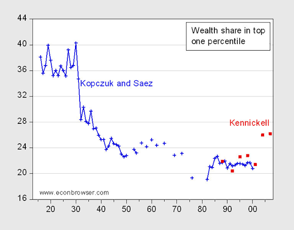
Figure 1: Wealth share of the top one percentile, from Kopczuk and Saez (2004) (blue +), and from Kennickell (2009) (red squares). Source: Kopczuk and Saez [xls] and Kennickell (2009), tables A3a-g
I don’t see the peak in wealth associated with the top 1% in the 1940’s as the reader asserts (looks like around 1930 to me), but I’ll leave that aside. As far as I can tell, inequality in 2007 exceeds that over most of the 1940’s. A caveat is necessary, because we have a 2007 estimate by Kennickell based on Survey of Consumer Finances, and 1940’s estimates by Kopczuk and Saez based on Estate tax return data. Nonetheless, similar movements and levels over the overlapping time periods suggests that the series are not completely non-comparable.
The last two red squares are at 2004 and 2007, respectively. Note the big jump going from 2001 to 2004, and the plateau to 2007.
It’s interesting to see what the authors concluded from their studies. From the abstract to Wojciech Kopczuk and Emmanuel Saez, “Top Wealth Shares in the United States, 1916–2000: Evidence from Estate Tax Returns,” National Tax Journal 57(2) part 2:
This paper presents new homogeneous series on top wealth shares from 1916 to 2000 in the United States using estate tax return data. Top wealth shares were very high at the beginning of the period but have been hit sharply by the Great Depression, the New Deal, and World War II shocks. Those shocks have had permanent effects. Following a decline in the 1970s, top wealth shares recovered in the early 1980s, but they are still much lower in 2000 than in the early decades of the century. Most of the changes we document are concentrated among the very top wealth holders with much smaller movements for groups below the top 0.1 percent. Consistent with the Survey of Consumer Finances results, top wealth shares estimated from Estate Tax Returns display no significant increase since 1995. Evidence from the Forbes 400 richest Americans suggests that only the super–rich have experienced significant gains relative to the average over the last decade. Our results are consistent with the decreased importance of capital incomes at the top of the income distribution documented by Piketty and Saez (2003), and suggest that the rentier class of the early century is not yet reconstituted. The paper proposes several tentative explanations to account for the facts.
Piketty and Saez’s data sample ends in 2000, before the last boom. What do we glean from more recent data? From Arthur Kennickell, “Ponds and Streams: Wealth and Income in the U.S., 1989 to 2007,” Finance and Economics Discussion Series paper No. 2009-13:
Much discussion treats the working definitions of wealth and income as if they were self-evident, but definitional choices can make substantial differences in the overall picture. To provide a clear basis on which to examine family wealth and income their interrelationship, this paper begins with a basic discussion of a range of possible measures of those concepts. Using the measures developed, the paper examines the distributions of wealth and income and their joint properties using data from the 1989–2007 waves of the Survey of Consumer Finances (SCF). Among other things, the data show a complicated pattern of shifts in the wealth distribution, with clear gains across the broad middle and at the top. For income, there is a more straightforward picture of rising inequality. Over this period, wealth as a fraction of income moved up across both the distributions of wealth and income. Nonetheless, their joint copula distributions (a type of distribution with uniform margins) do not show noticeable changes over this time. The consistent pattern is that very high wealth and income and very low wealth and income go together, but in between these poles, the relationship is fairly diffuse. The paper also presents information on the composition of wealth and income over the 18-year period; the general patterns of holdings across the distributions did not change markedly, but there were some important shifts. For wealth, debt increased as a share of assets across the wealth distribution, the share of principal residences rose mainly below the median of net worth, the share of taxdeferred retirement accounts rose and the share of other financial assets declined. For income, the clearest change was a general decline in the relative importance of capital income other than that from businesses.
For completeness’s sake, I reprise this graph of income accruing to the top 1% and 5%, calculated in a manner comparable over the period 1913-2008:
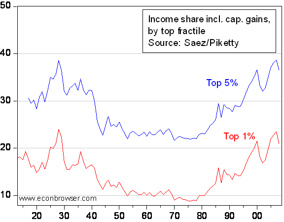
Figure 2: Pretax income shares (including realized capital gains) accruing to top 5% of households (blue line) and to top 1% (red line). Source: updated version of Piketty and Saez (2007)
Wealth Inequality: A Time Series Plot
Disclaimer: This page contains affiliate links. If you choose to make a purchase after clicking a link, we may receive a commission at no additional cost to you. Thank you for your support!


Leave a Reply