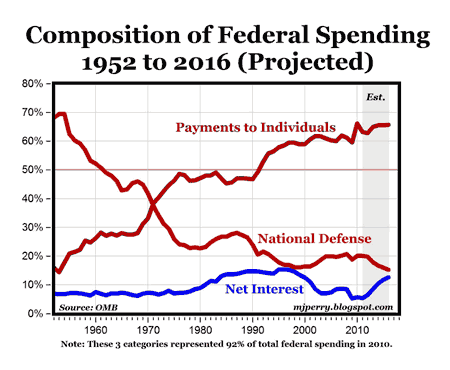
1. Chart 1: As “payments to individuals” becomes a greater and greater share of the federal budget……
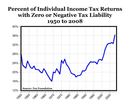
2. Chart 2: The percent of taxpayers with zero or negative tax liability goes up….
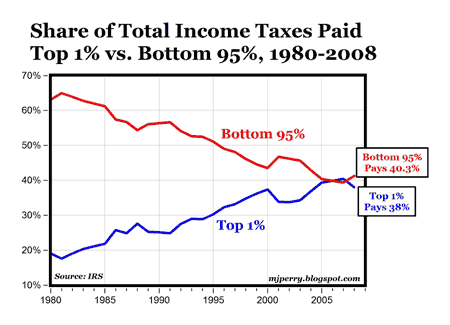
3. Chart 3: And the share of taxes paid by the top 1% goes up and the share of taxes paid by the bottom 95% goes down.
As John Merline points out in his excellent editorial:
“When you put these two trends together, what you find is that the federal government has over the years essentially turned into a gigantic wealth-transfer machine — taking money from a shrinking pool of taxpayers and giving it out to a growing list of favored groups.”
Disclaimer: This page contains affiliate links. If you choose to make a purchase after clicking a link, we may receive a commission at no additional cost to you. Thank you for your support!

Leave a Reply